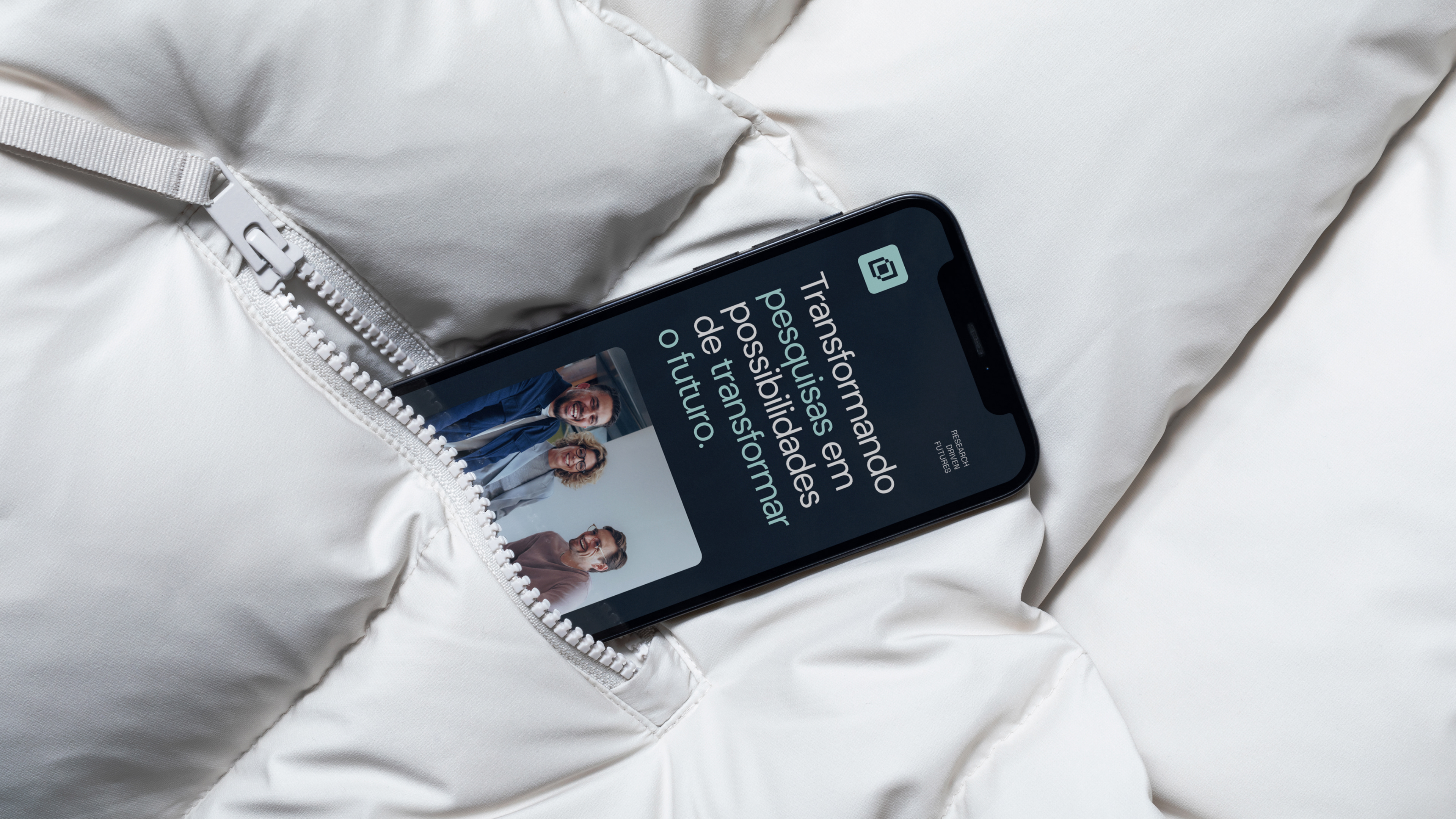
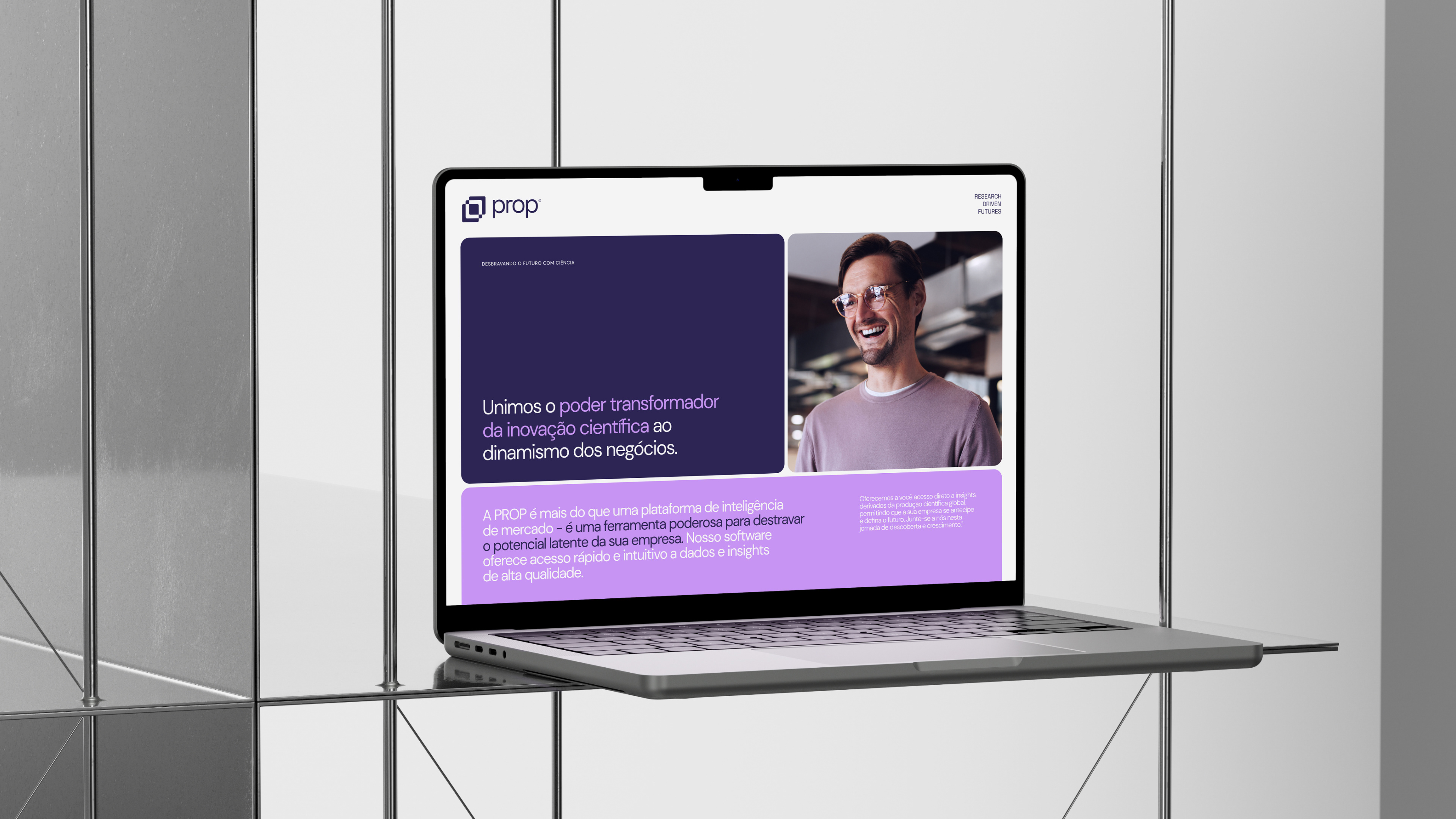
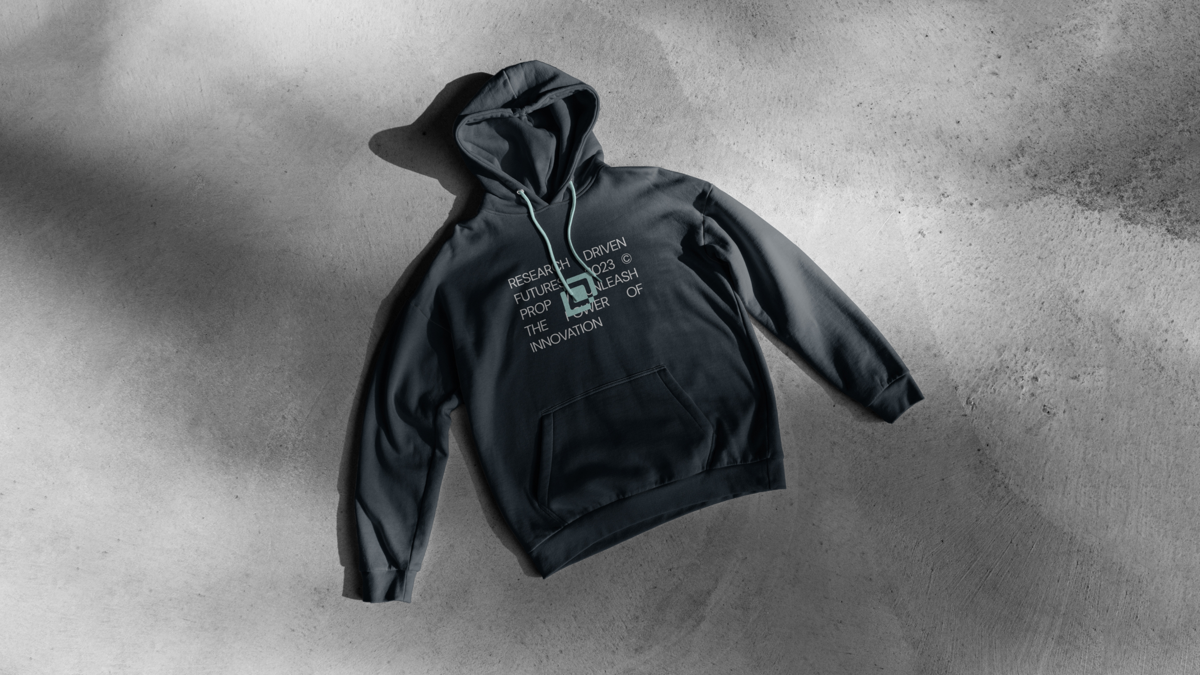
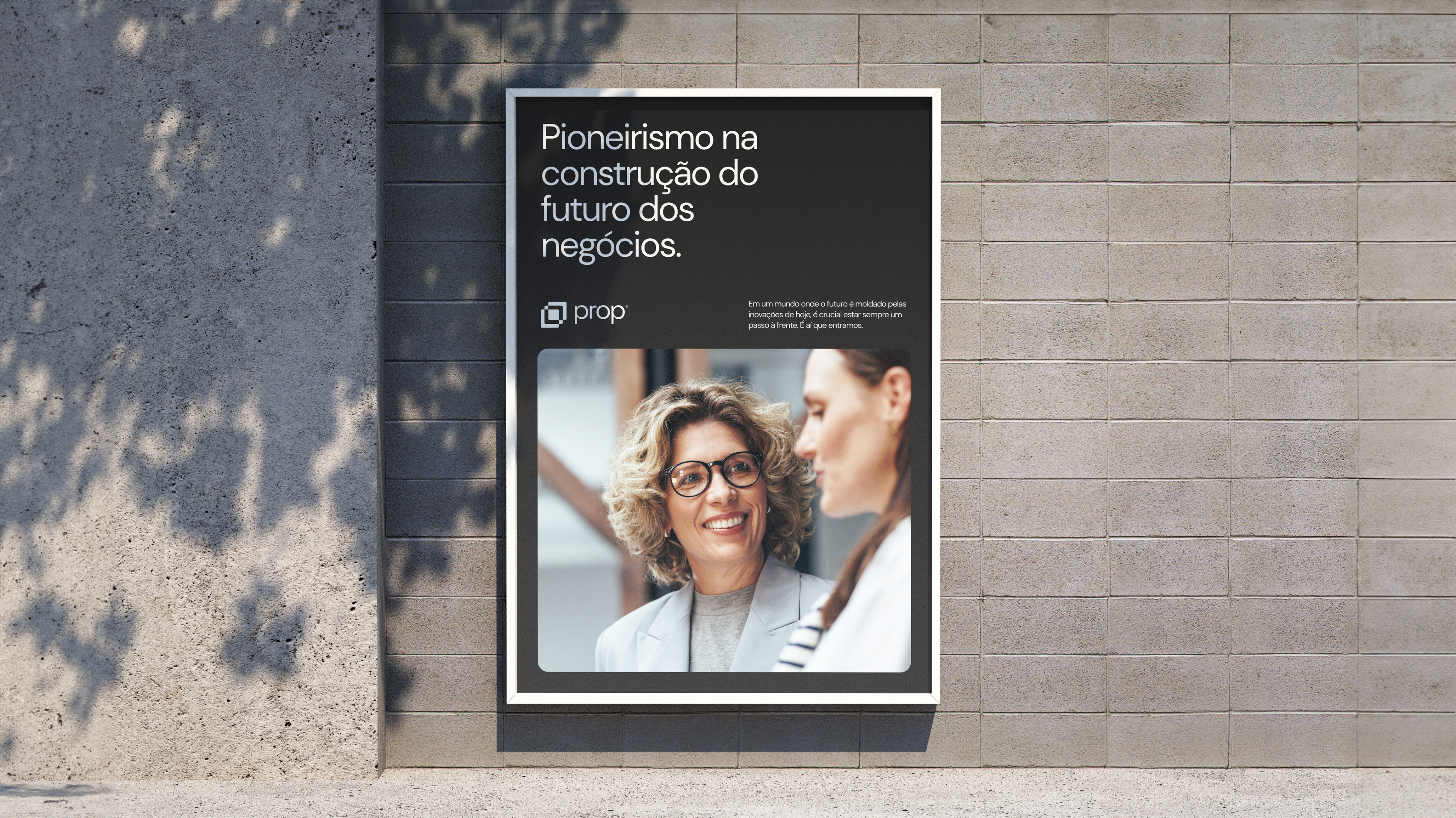
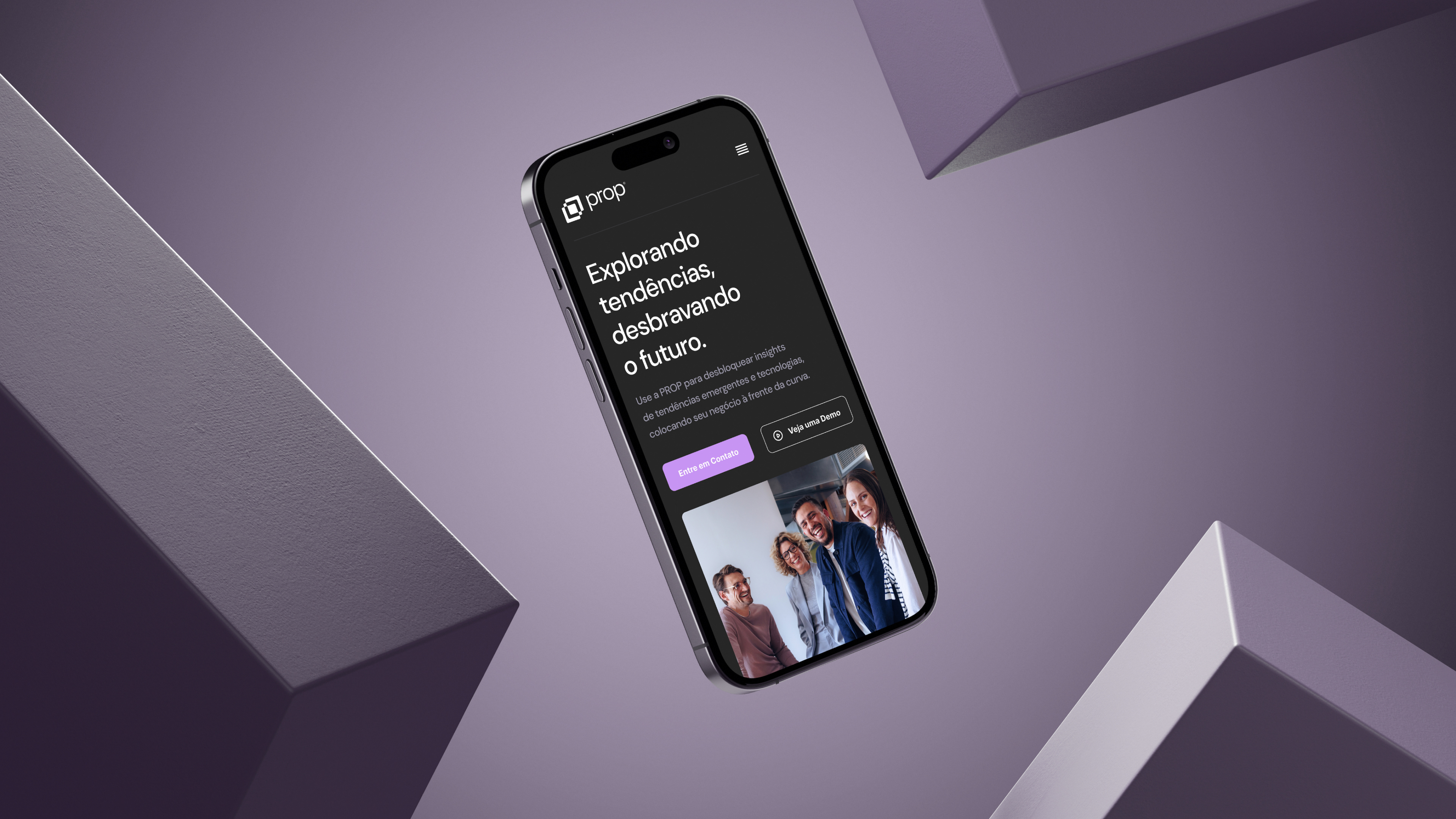
Prop
In a fast-paced tech era, linking scientific breakthroughs to practical applications is paramount. Prop illuminates this path, enabling businesses to unlock scientific innovation's potential. It's not just a market intelligence tool but a futuristic bridge between innovators and businesses. Prop's challenge was dual: to visually represent innovation and the future, and to navigate the immense global scientific data, converting insights into actionable steps. Our solution was a brand identity reflecting a pioneering spirit, using modern colors and a unique geometric symbol. This branding encapsulates Prop's commitment to innovation, collaboration, and real-world change.
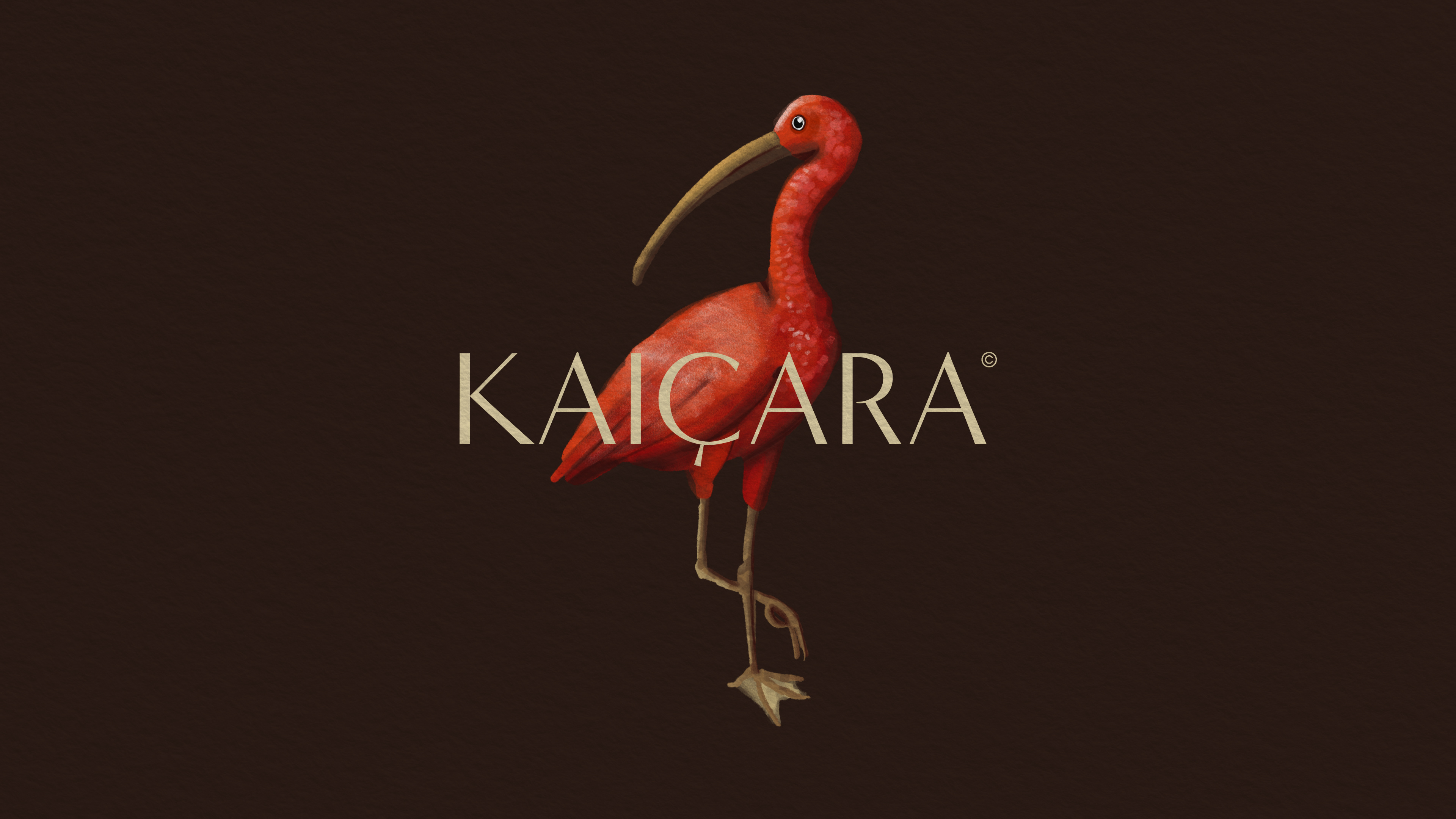
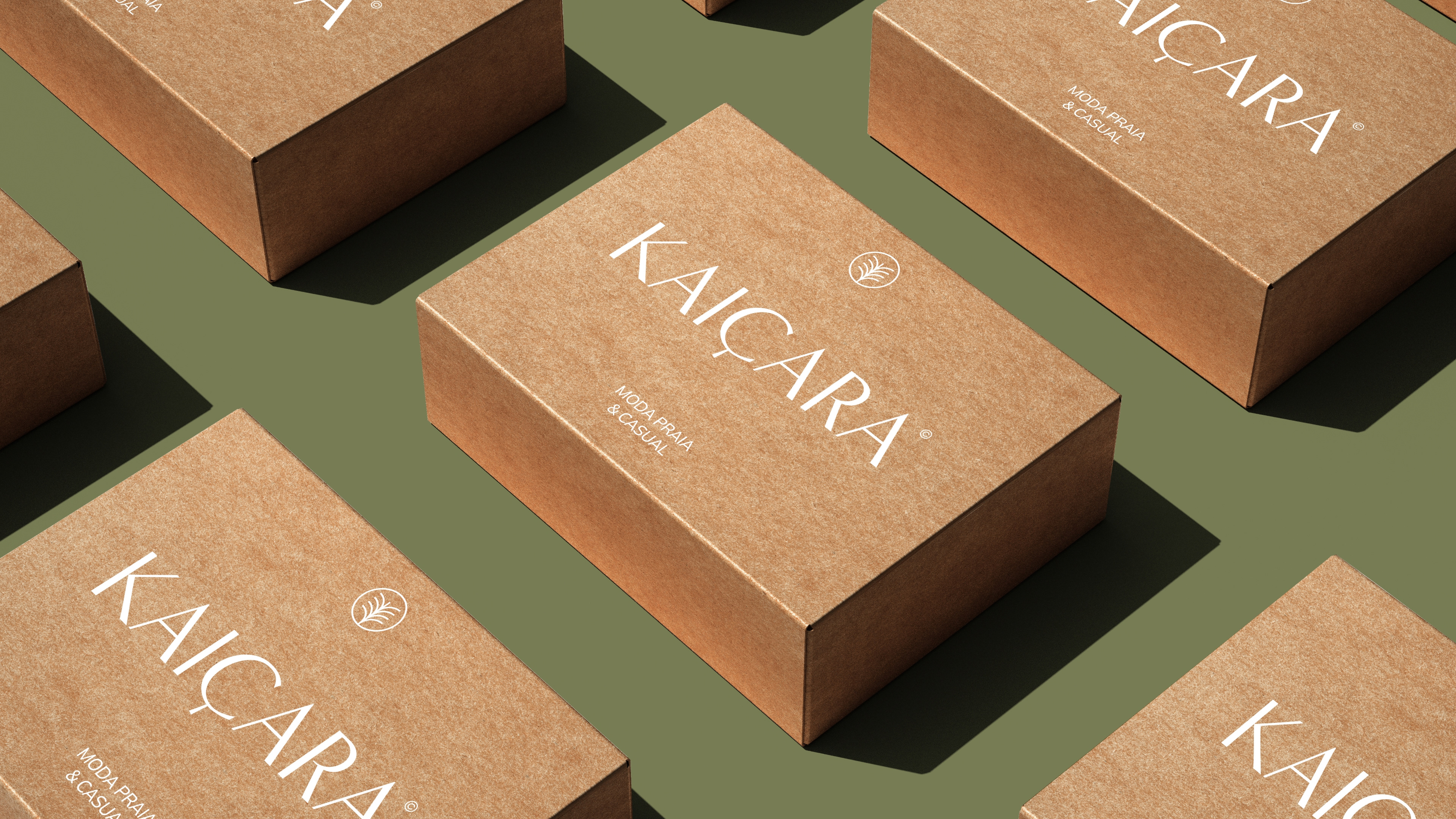
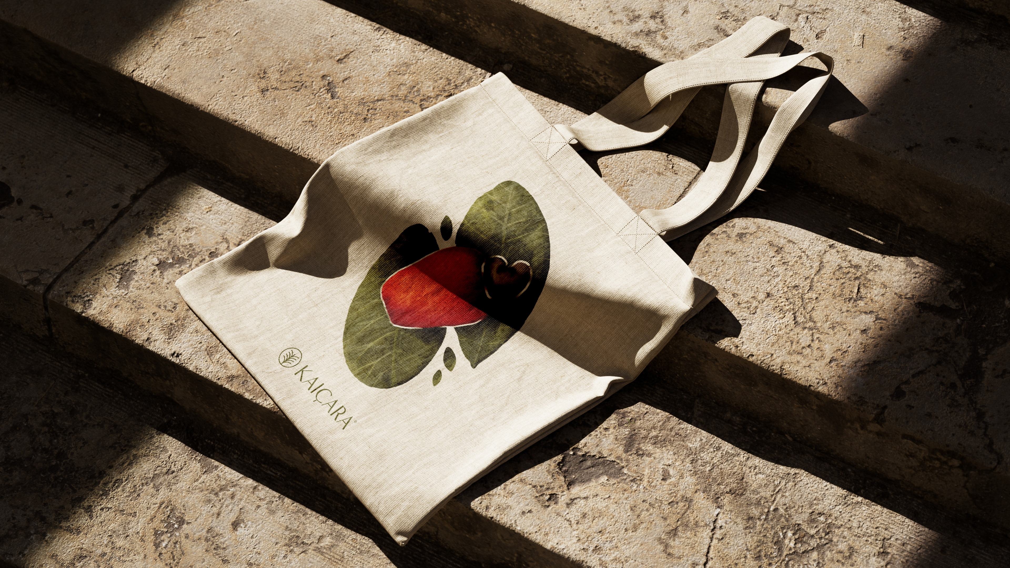
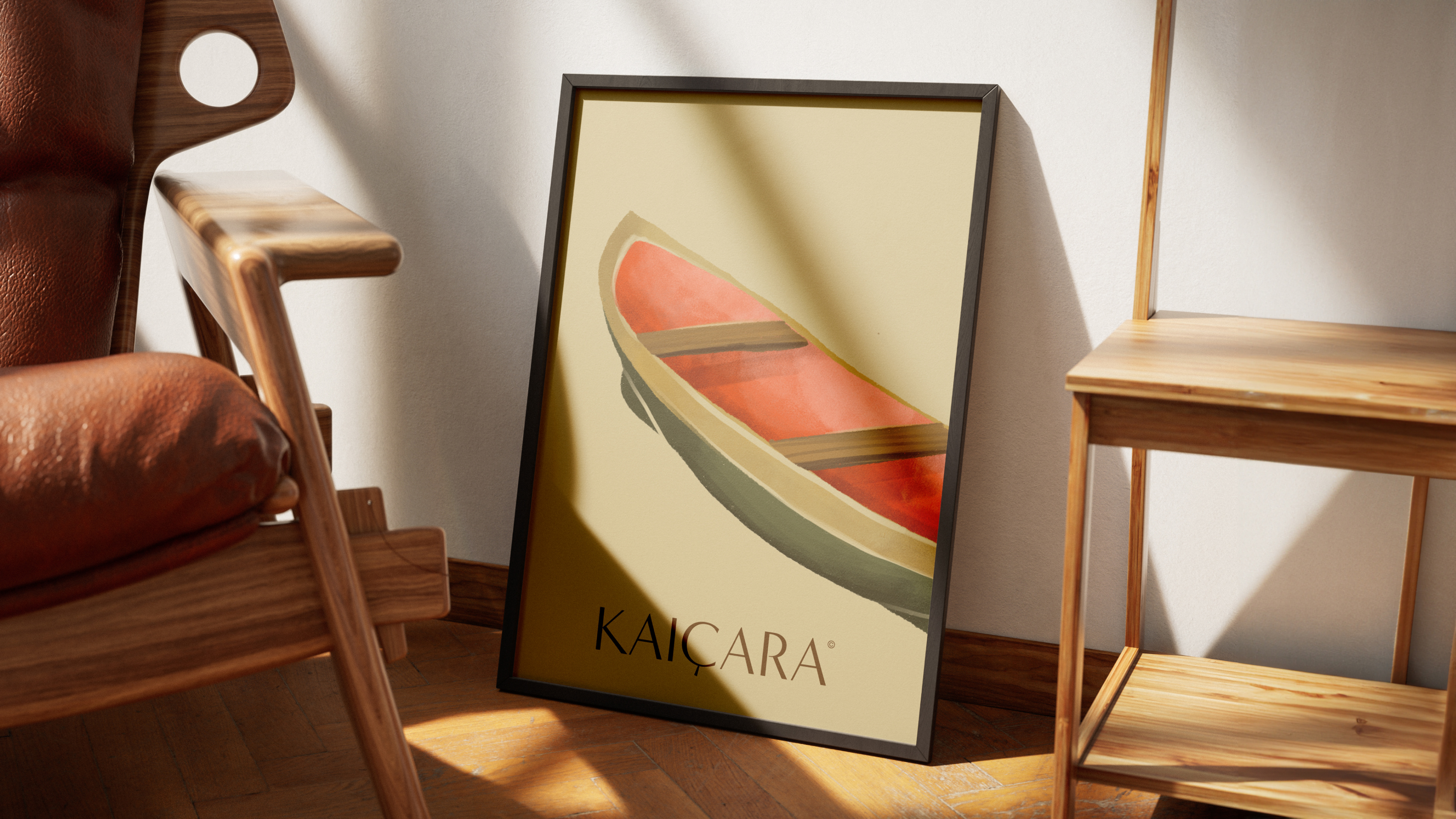
Kaiçara
A brand blending style with sustainability, Kaiçara offers more than beach fashion — it's a journey into a design realm inspired by nature and the caiçara culture. Initially a bikini brand, Kaiçara expanded into accessories and casual wear, necessitating a brand identity revamp to reflect this growth and stand out in a competitive market. The challenge was twofold: modernize the visual identity while preserving its cultural roots. Our solution encompassed a natural color palette, a coconut leaf-inspired symbol, elegant typography, and illustrations that pay homage to the caiçara lifestyle, including the scarlet ibis, cashew, caiçara canoe, fishing net with mullet, and the coconut leaf. This rebranding encapsulates Kaiçara's essence, intertwining authenticity, sophistication, and cultural respect.
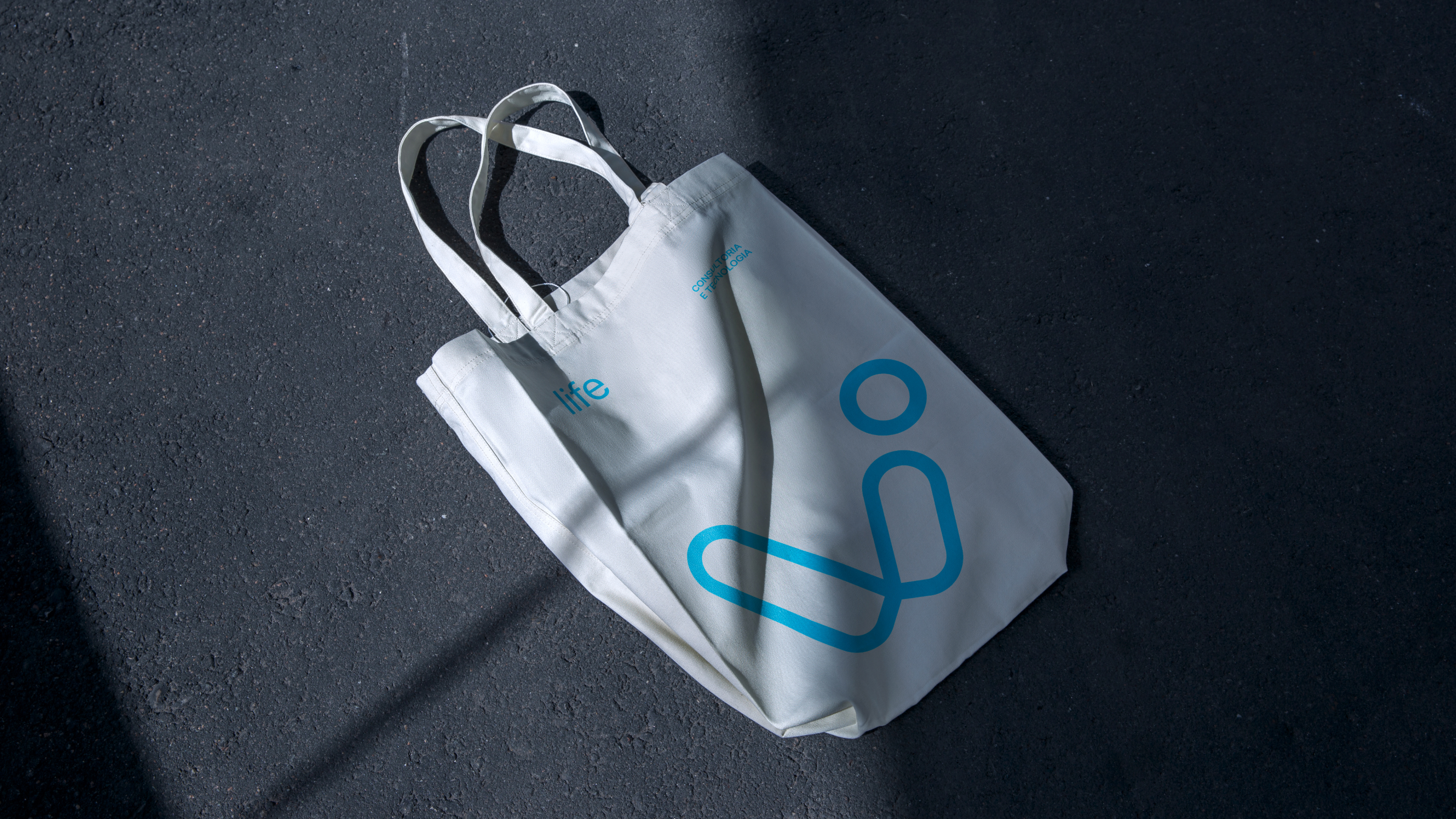
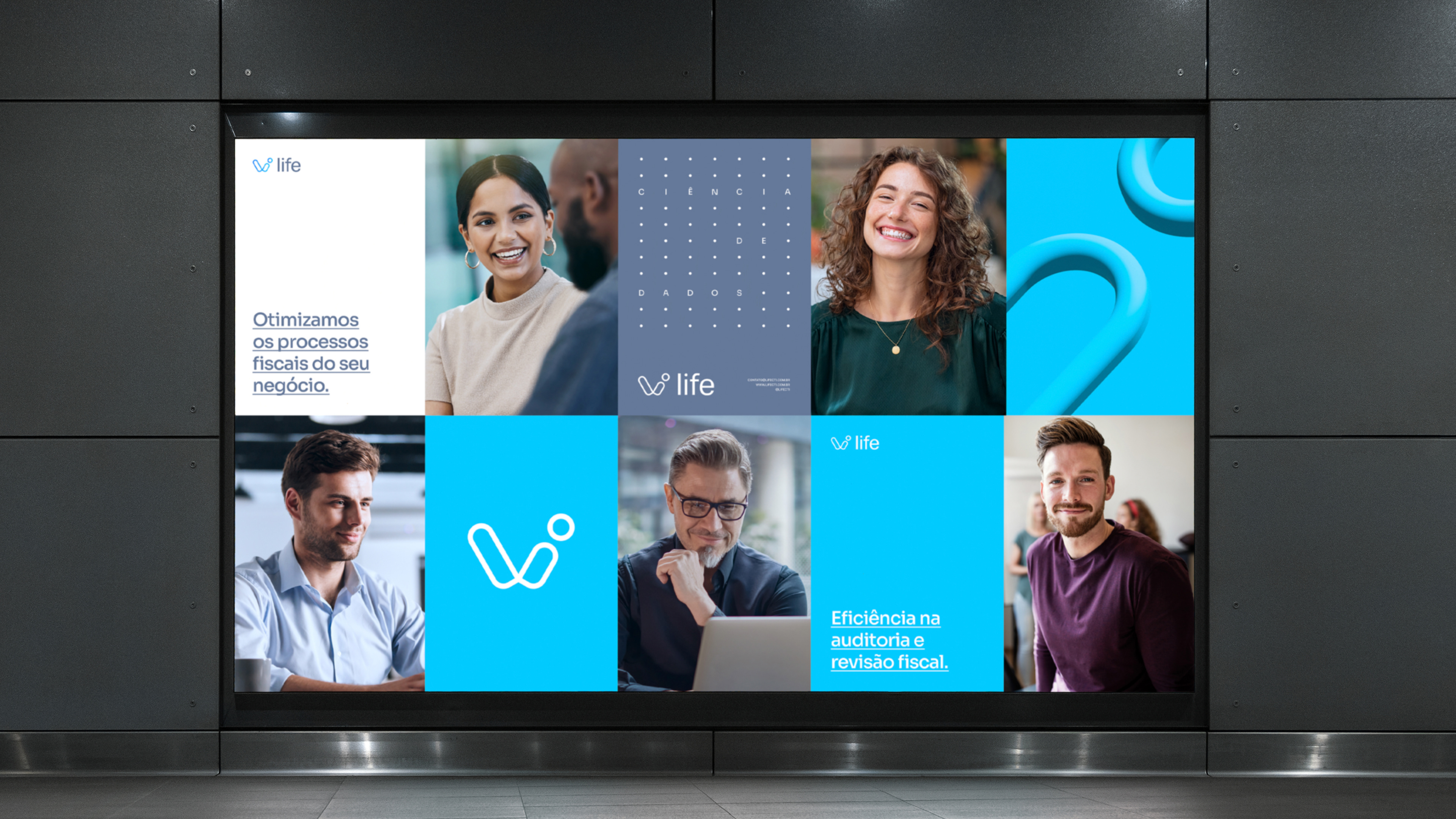
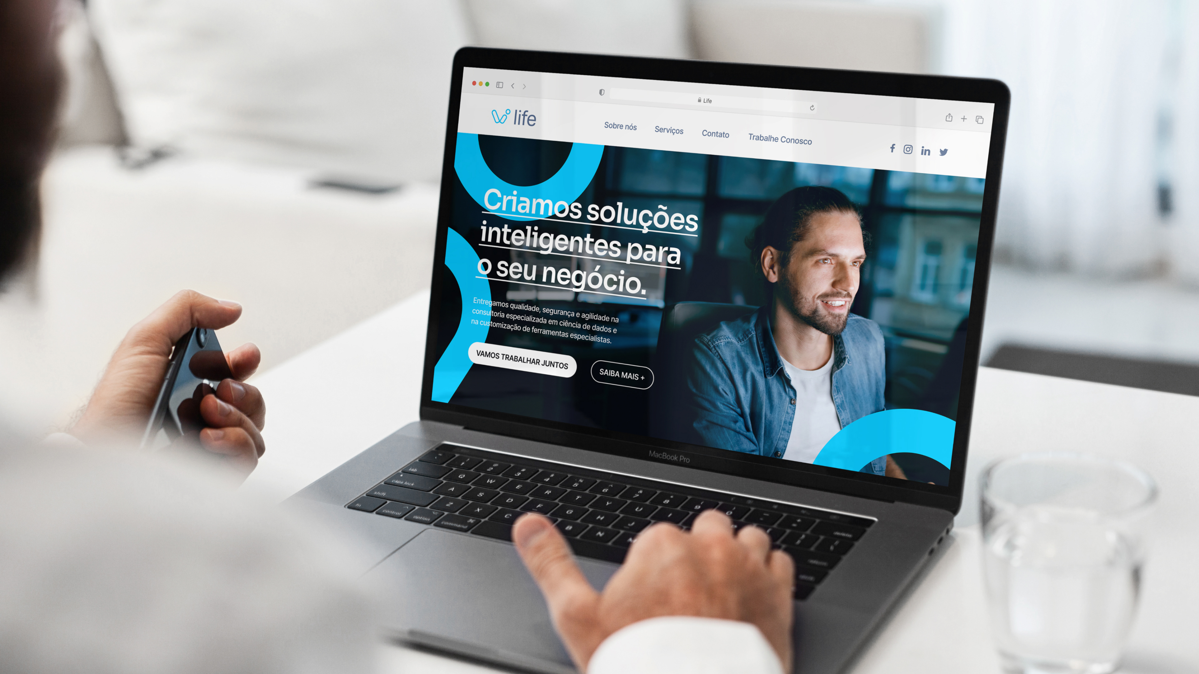
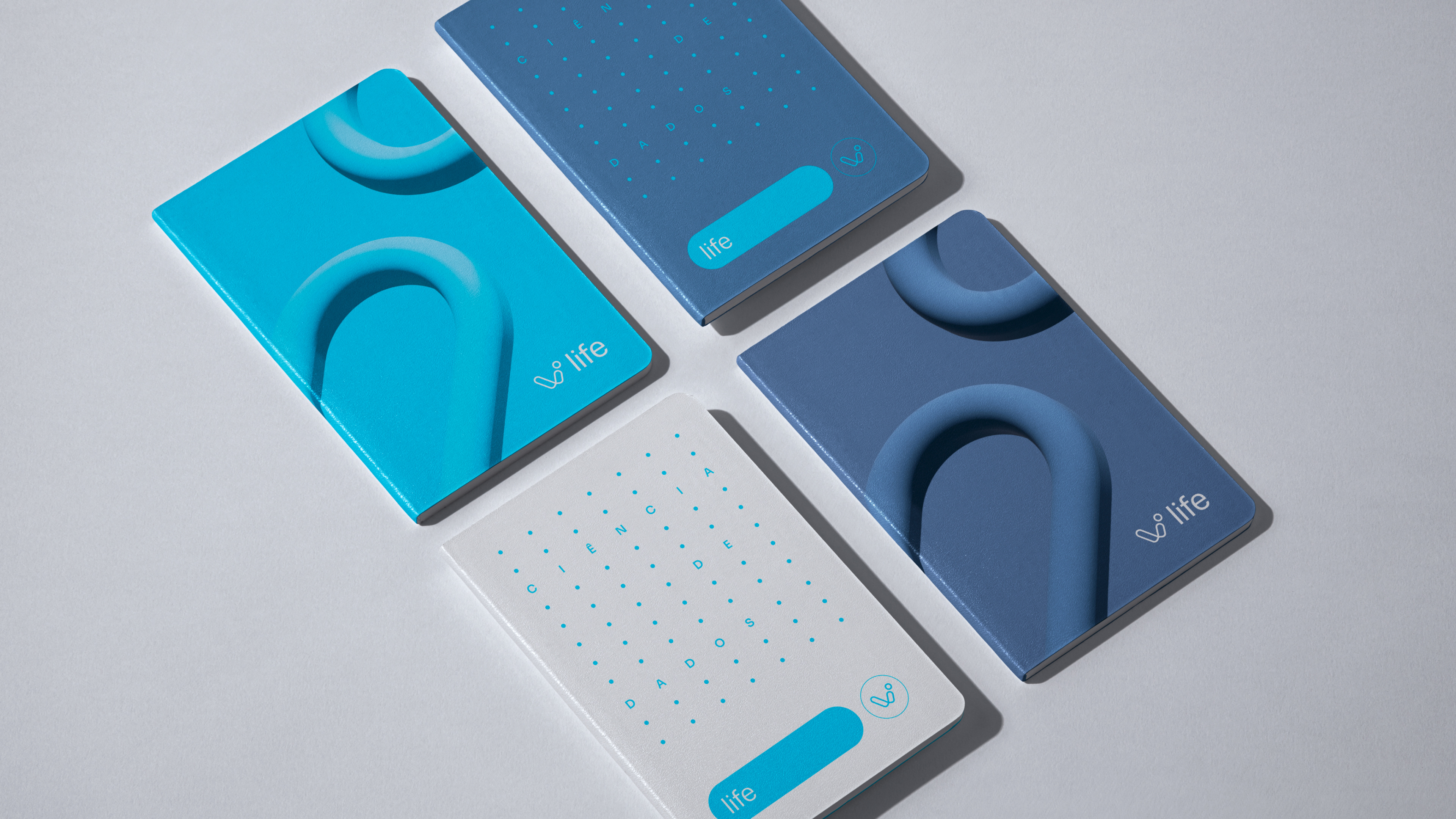
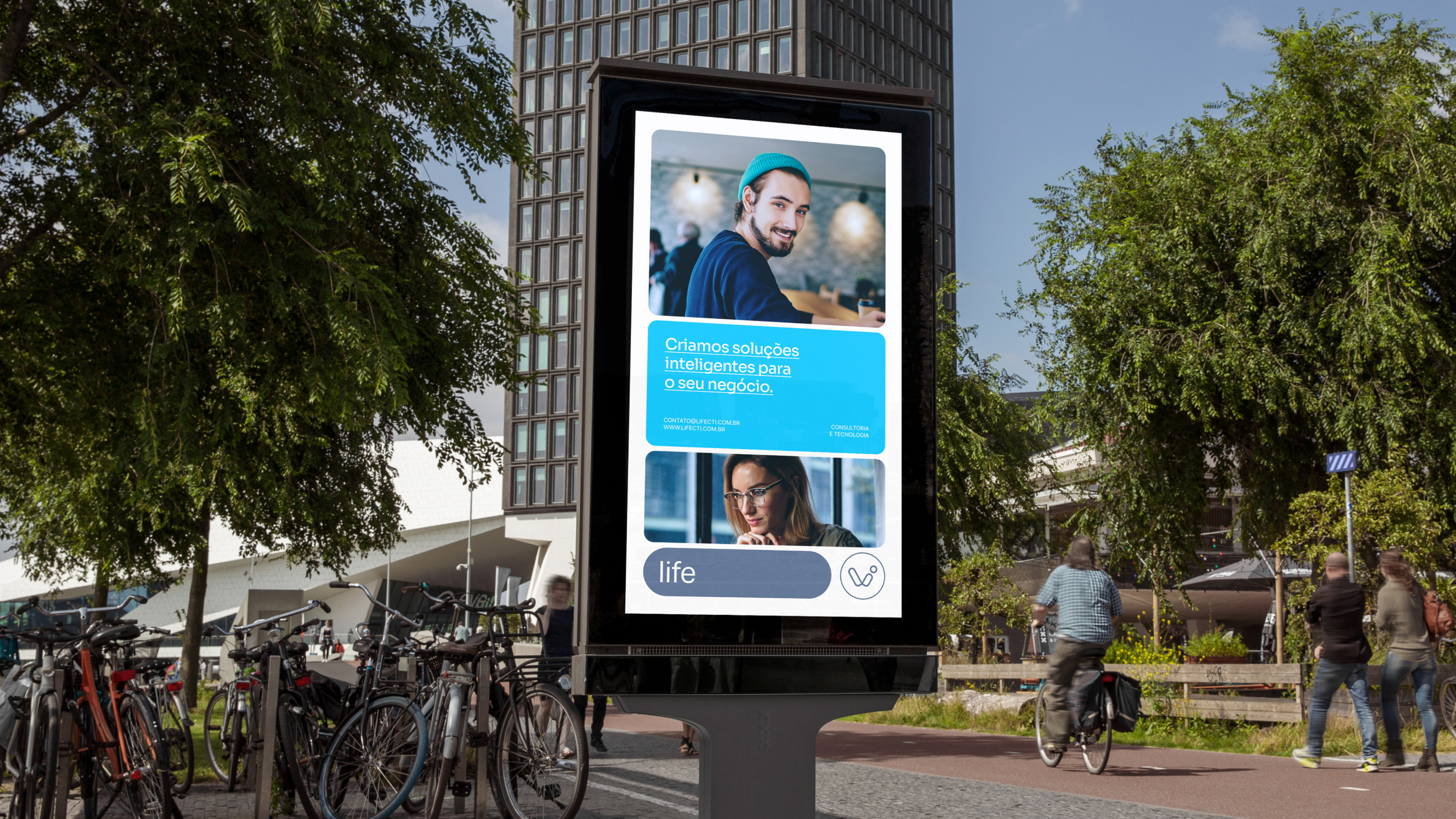
Life
A frontrunner in data science and tax avoidance, Life provides solutions for large data sets, specializing in analyzing fiscal documents to recover tax credits and review fiscal stocks. With a history of recovering 450 million reais and defending 500+ infraction notices, they focus on consultancy and software development to bolster clients' fiscal health. Tasked with rebranding Life for its new phase, our goal was an identity reflecting innovation and modern design trends. We chose a vibrant "data dive blue" and trustworthy "cyber navy" color scheme, designed a symbol representing data interconnectivity, and used modern sans-serif fonts, encapsulating Life's tech-forward essence.
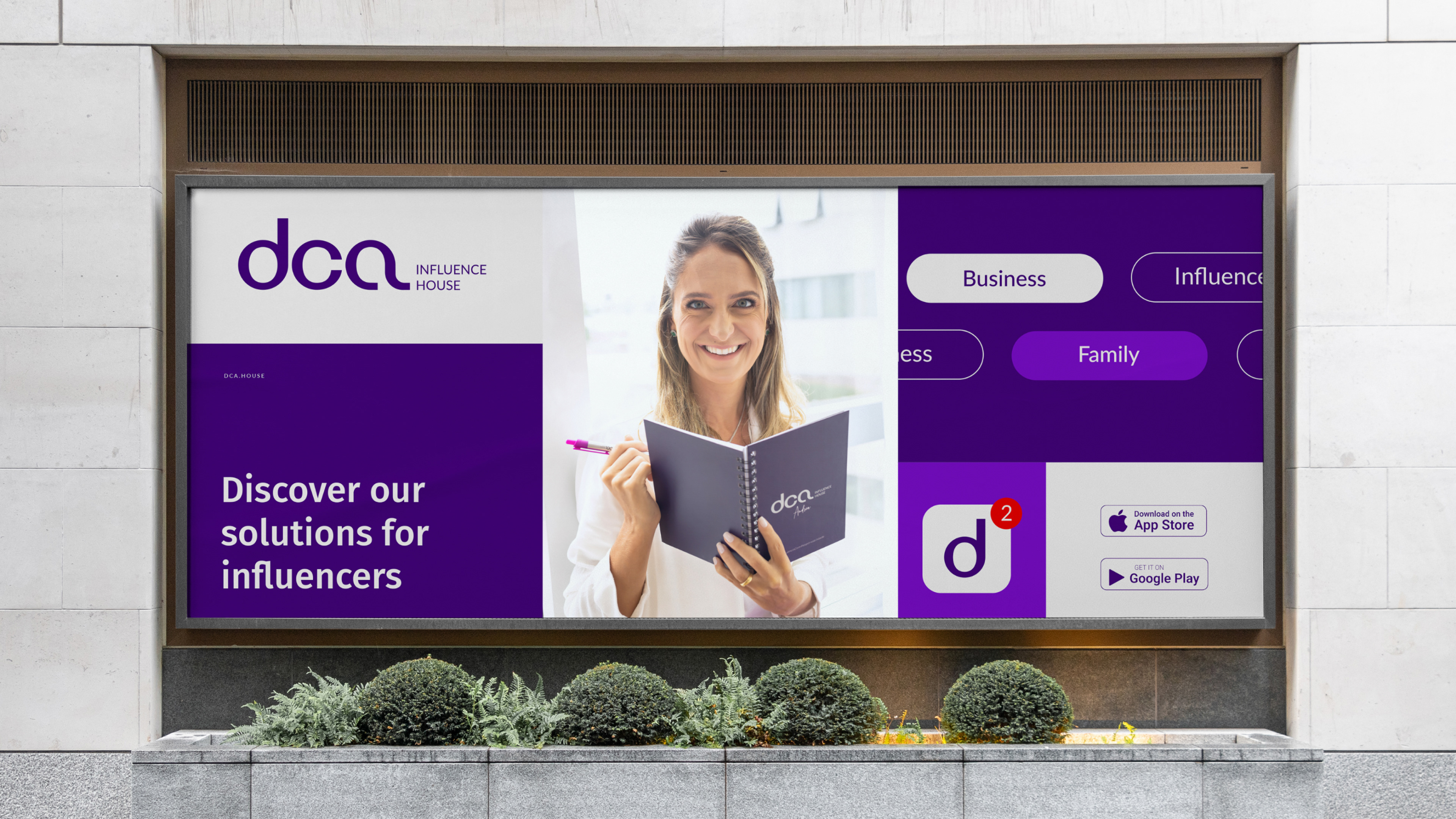
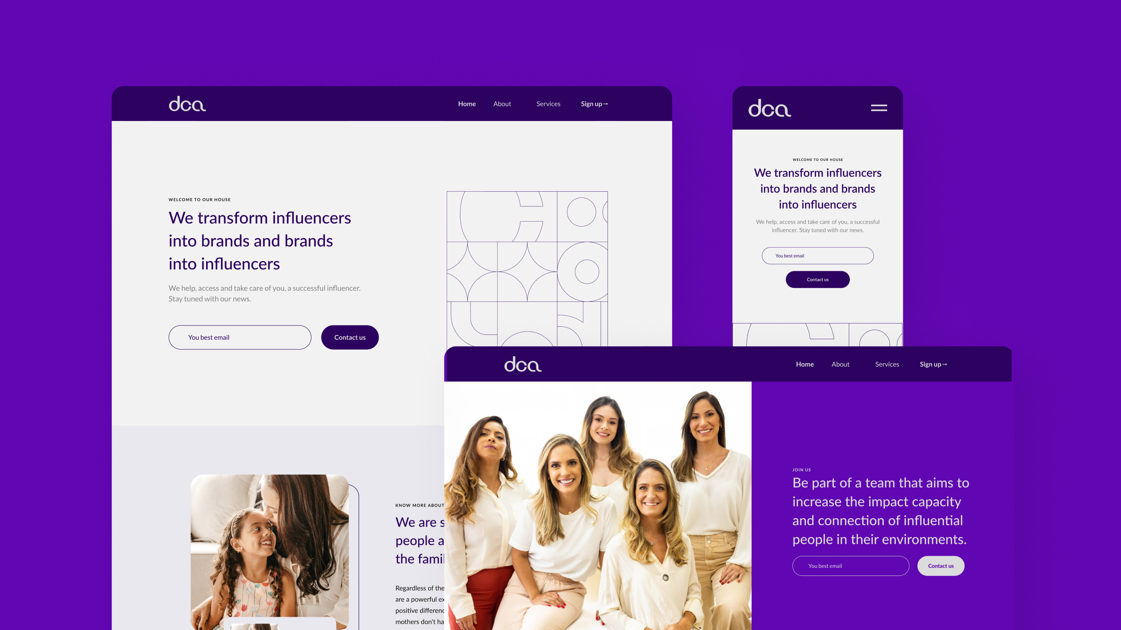
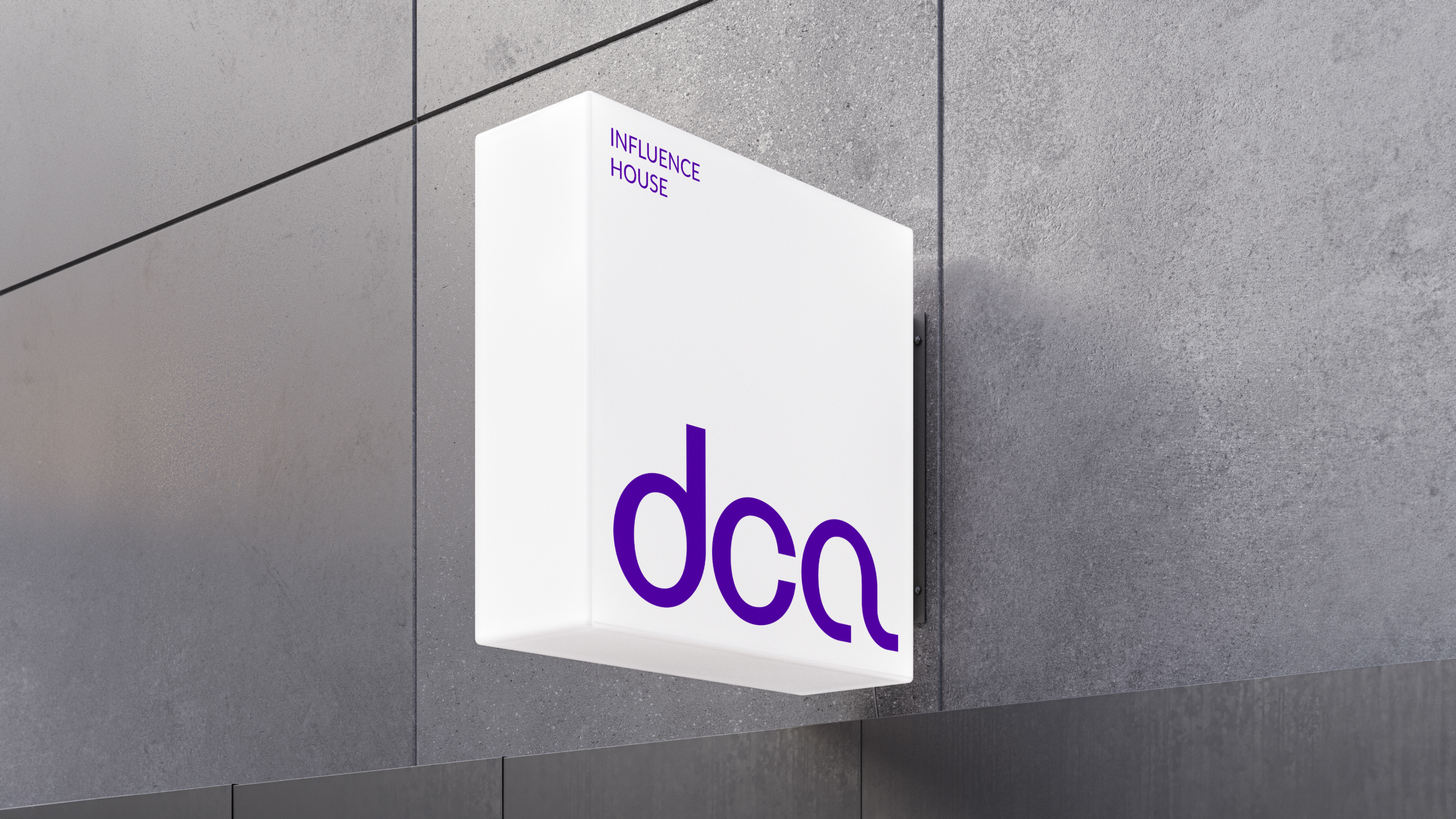
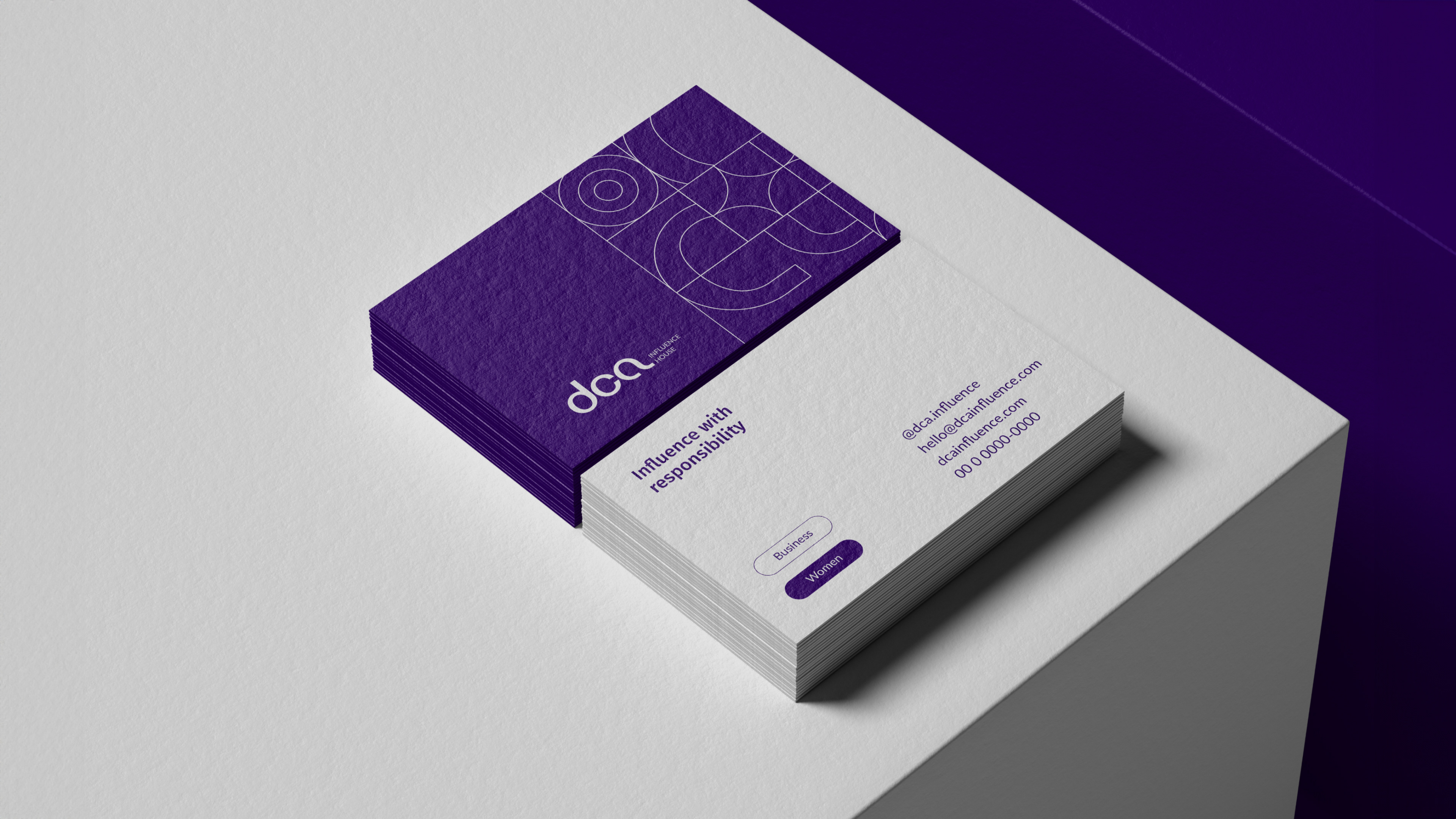
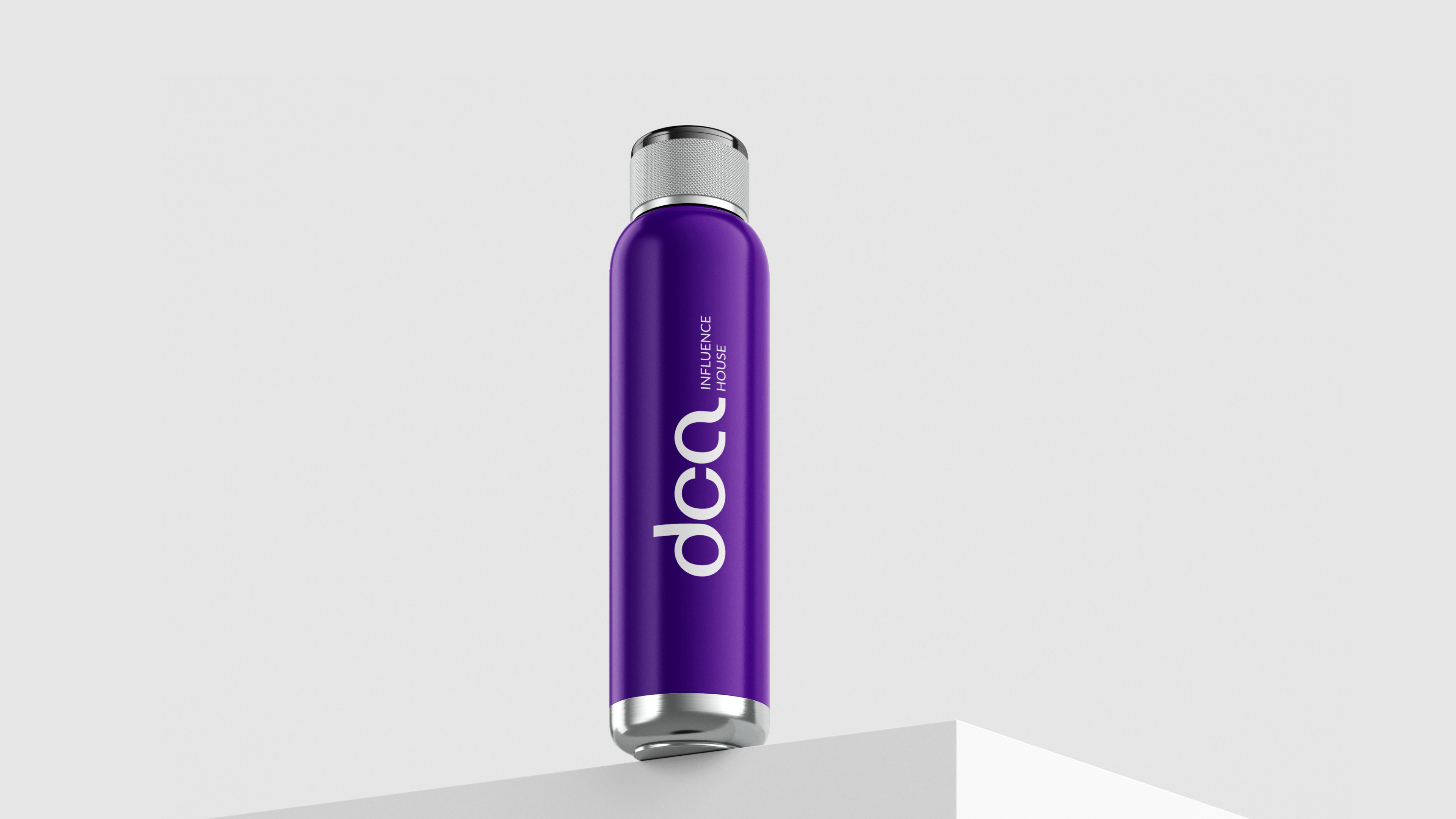
DCA Influence House
DCA specializes in aiding influencers aiming to become brands and brands aiming to become influencers. With a seasoned team, they've led significant content projects and campaigns over the past decade, aiming to amplify influencers' impact and connectivity in both physical and digital realms. As they transitioned from consulting to an influence agency, they sought a brand redesign to reflect their evolution into the dynamic world of influence. Our design goal was a mature, authentic brand. We blended shades of purple for sophistication and vibrancy, crafted a custom typographic logo for modernity, and introduced a pattern showcasing the brand's versatility.
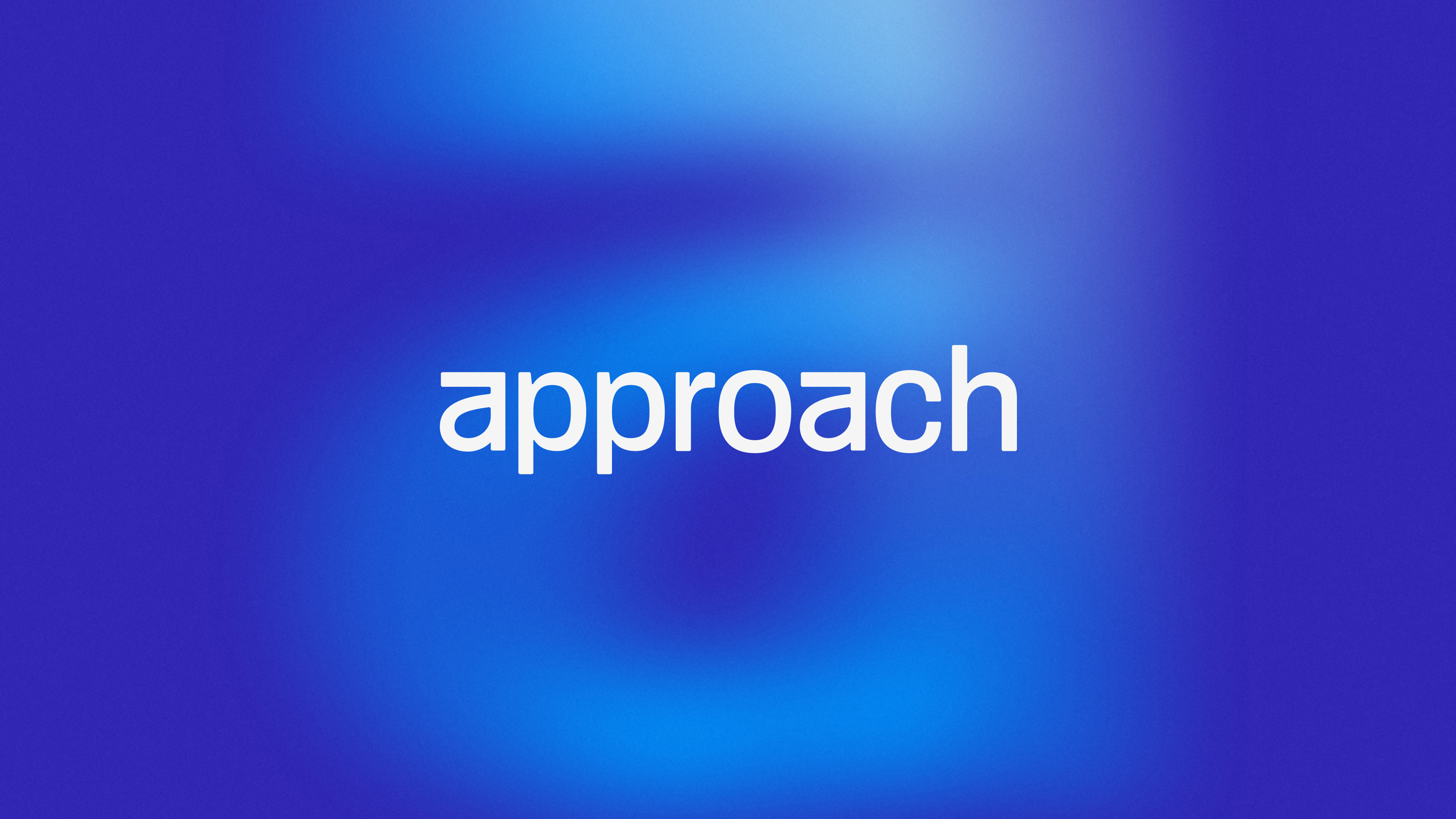
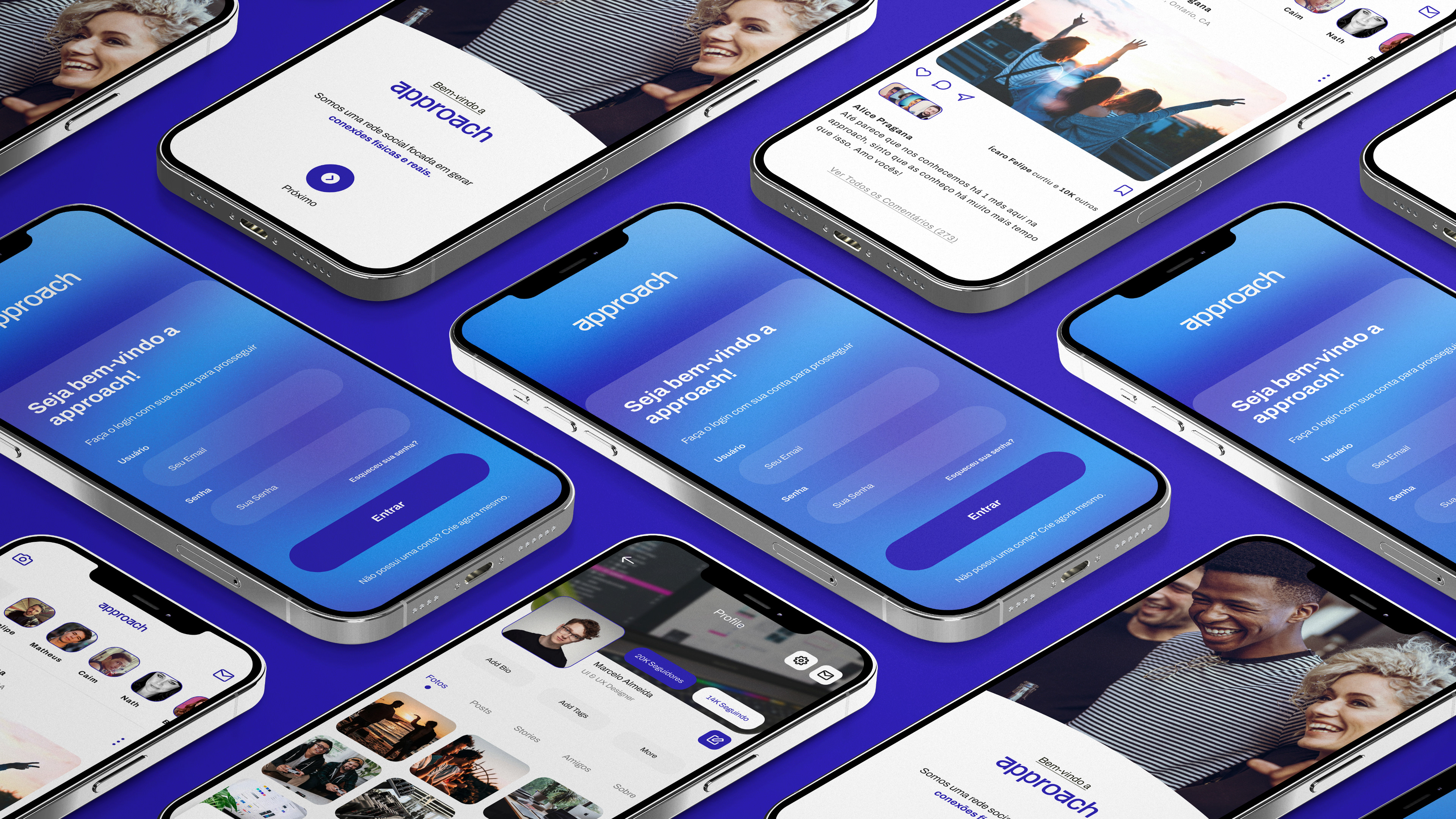
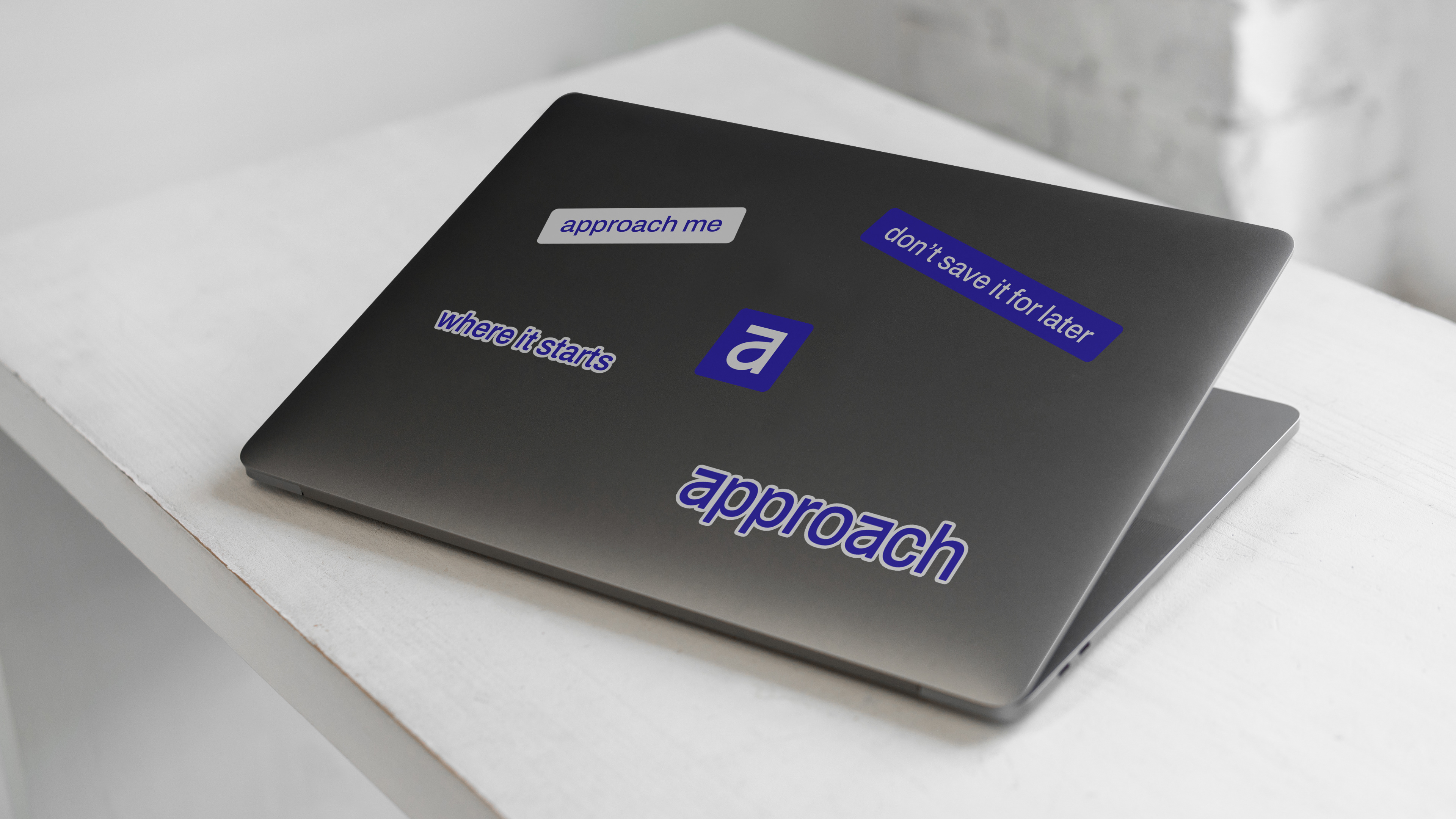
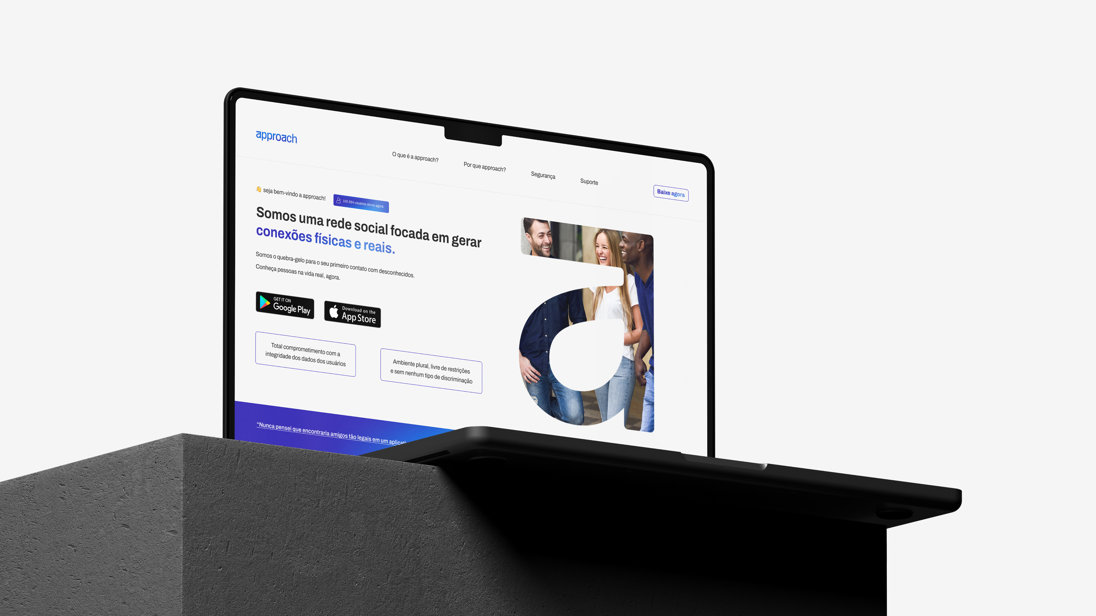
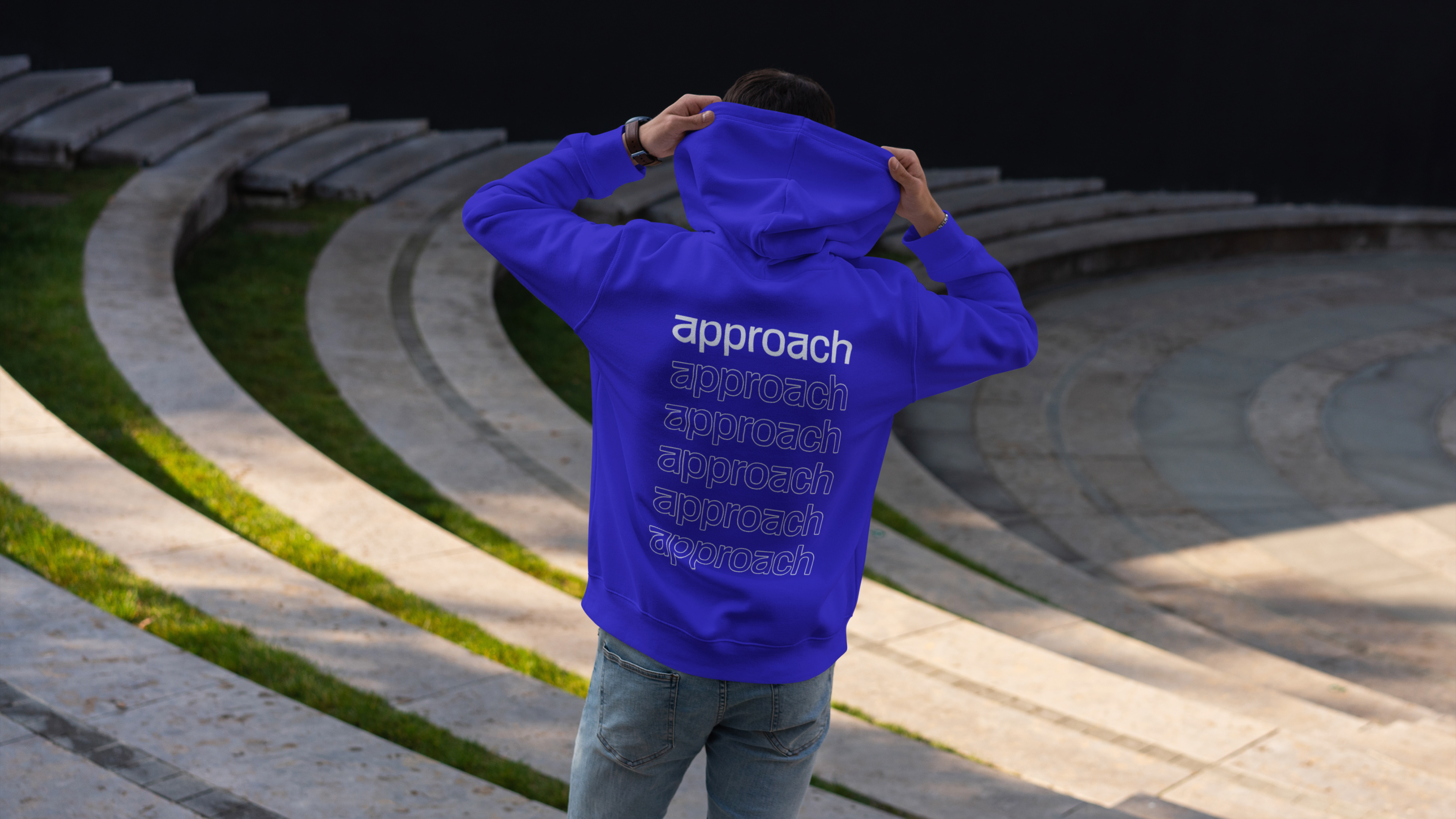
Approach
Tired of the daily grind and craving genuine connections? Enter Approach, a revolutionary platform shifting the focus from mere online interactions to real-world meetups. It's not just another social media site; Approach harnesses tech to enhance life quality by promoting genuine connections around shared interests. Tasked with crafting Approach's visual identity, we aimed for a modern, friendly, and human-centric design. Delving deep into the brand's core, we ensured every design element, from colors to typography, resonated with its ethos, resulting in a versatile identity fit for various platforms.
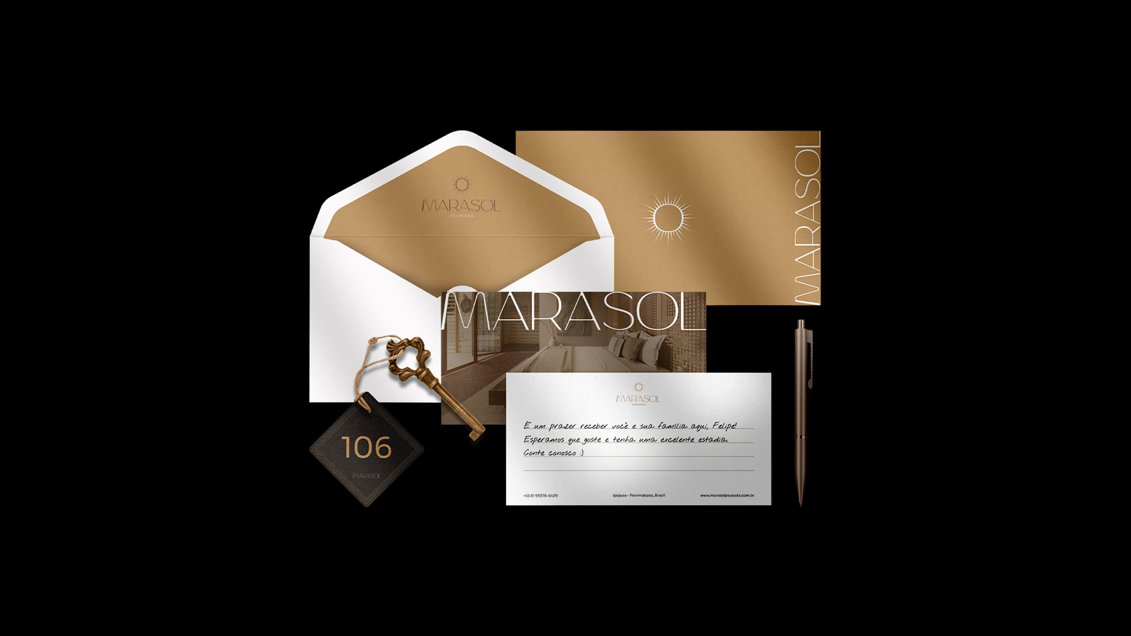
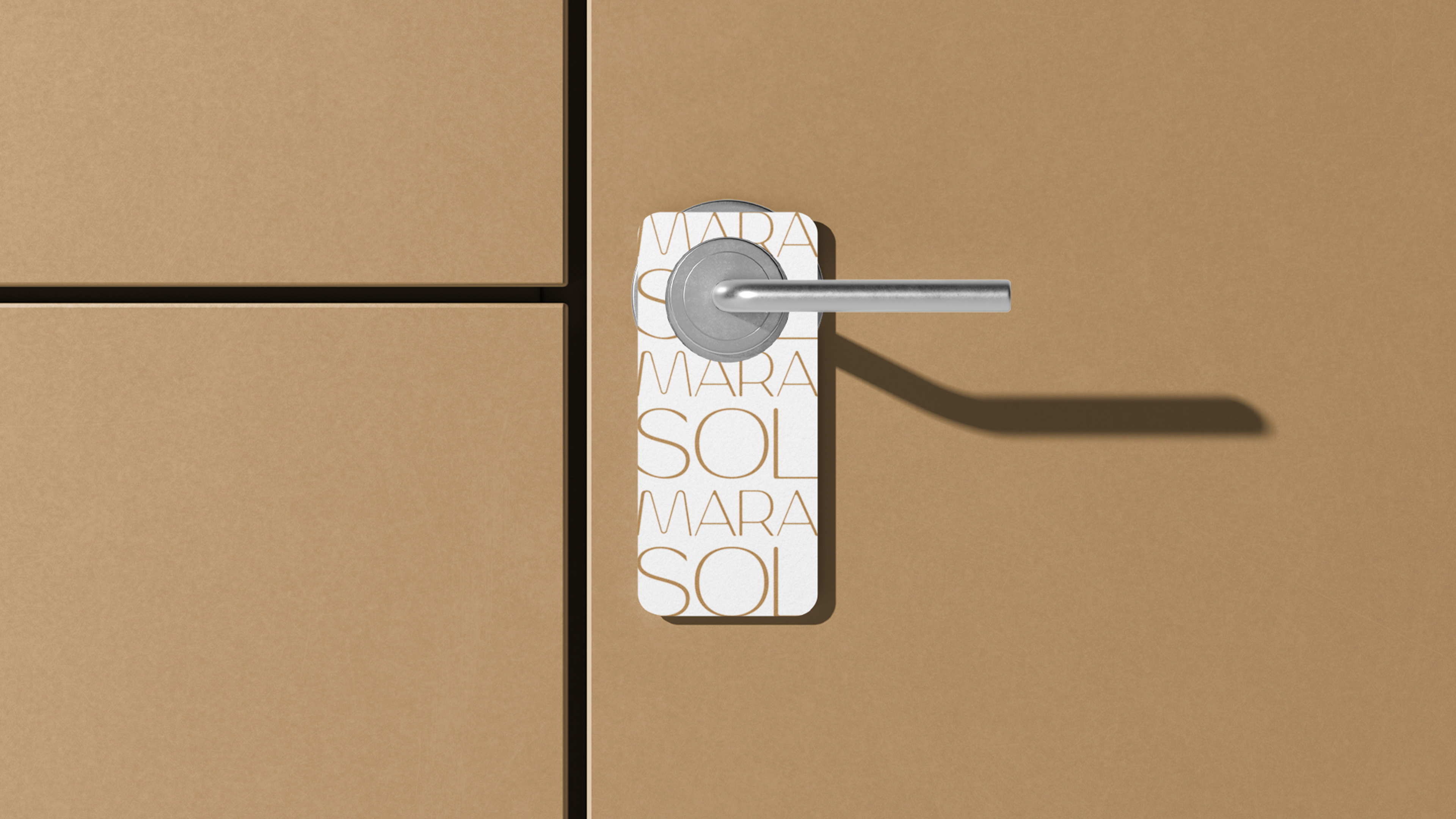
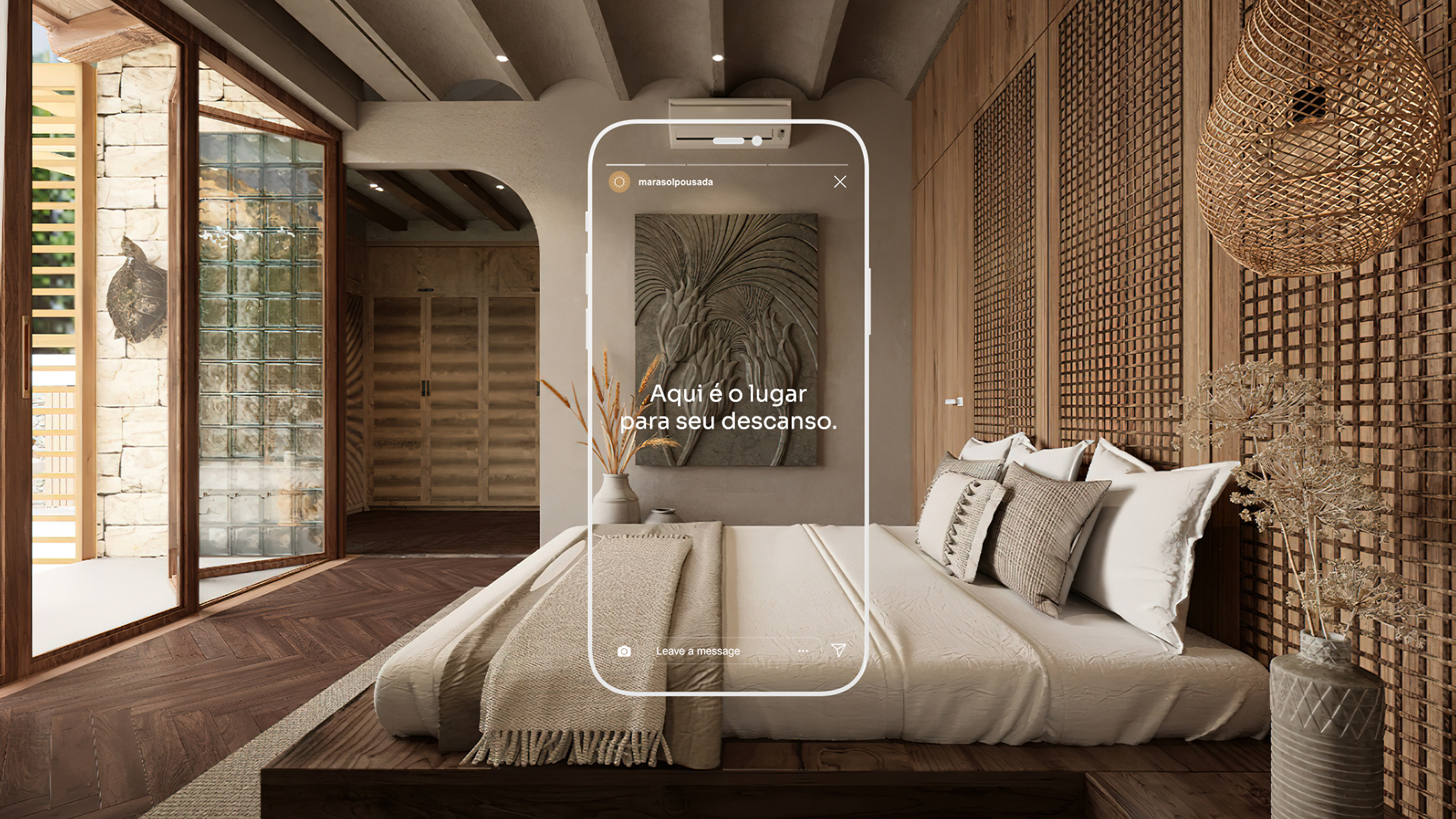
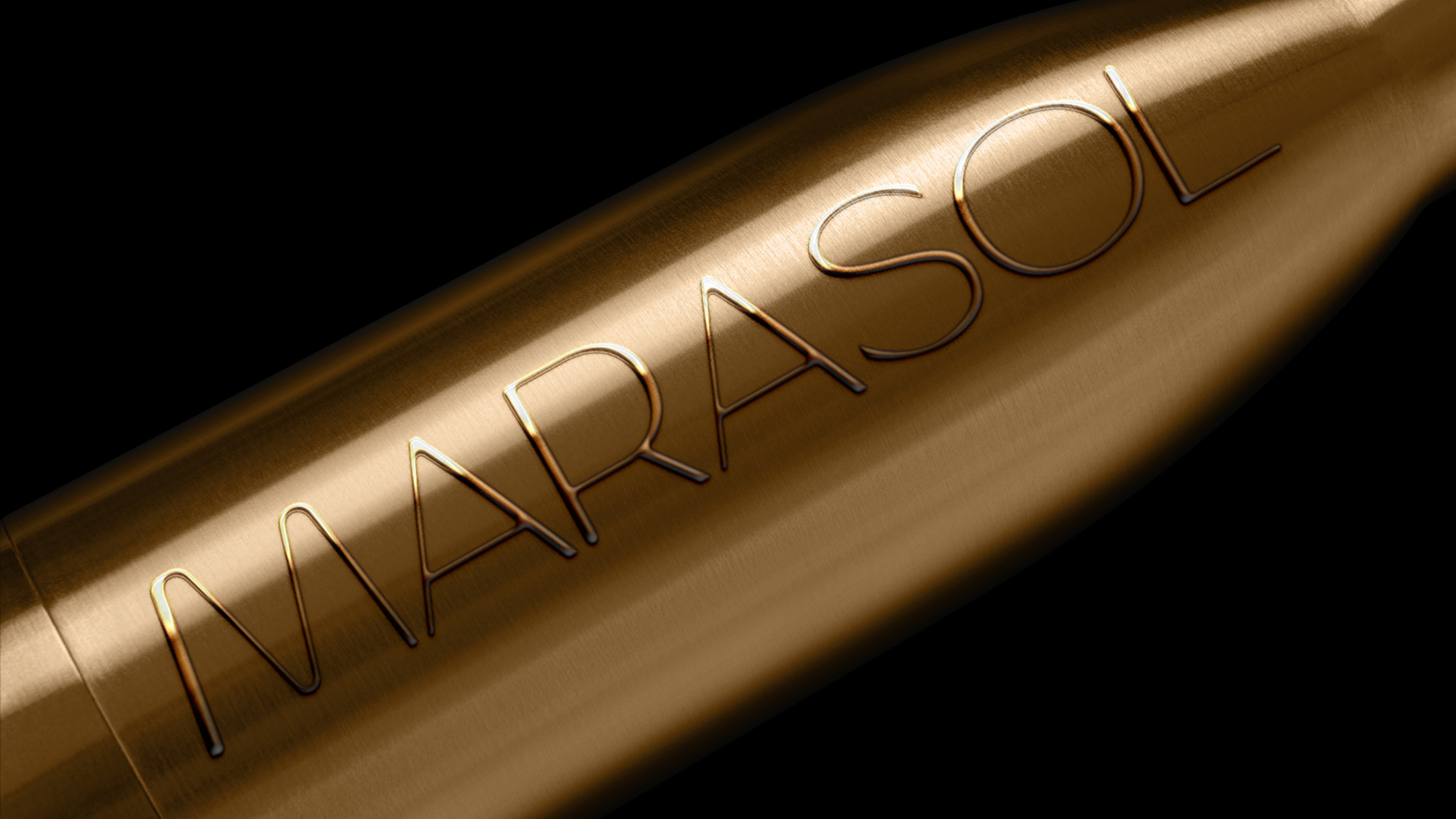
Marasol Pousada
Nestled in Porto de Galinhas - PE, a top Brazilian beach destination, Marasol offers an ideal blend of service, comfort, and leisure since its inception in December 2020. Our design encapsulates its essence with unique typography, reminiscent of sea waves, and colors mirroring the inn's rustic yet elegant ambiance. The minimalist symbol we crafted combines two resonant elements: the sun and the wind rose. Together, these elements create a rustic, inviting visual identity, encapsulating the tranquil experience Marasol Pousada promises its visitors.

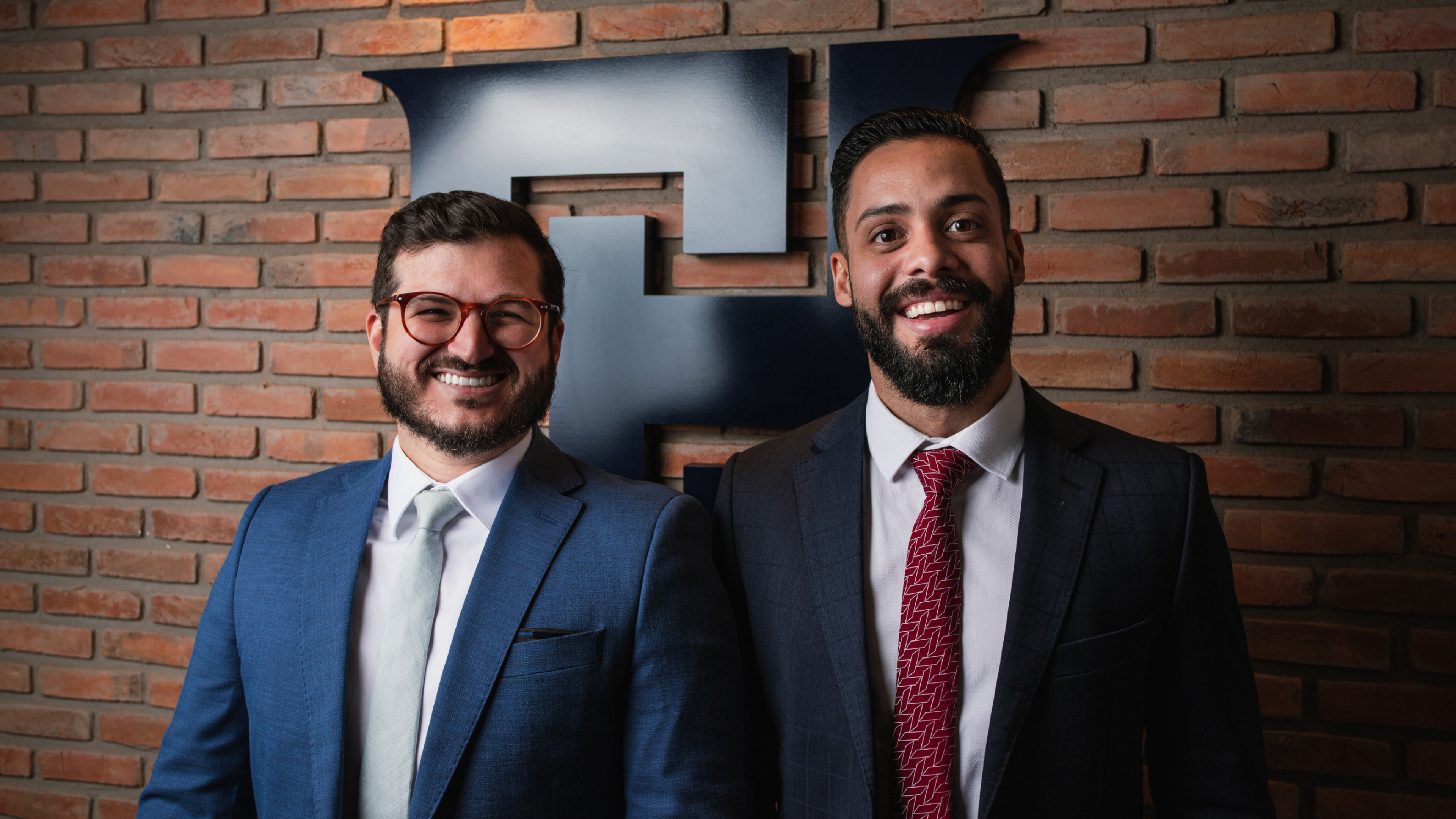
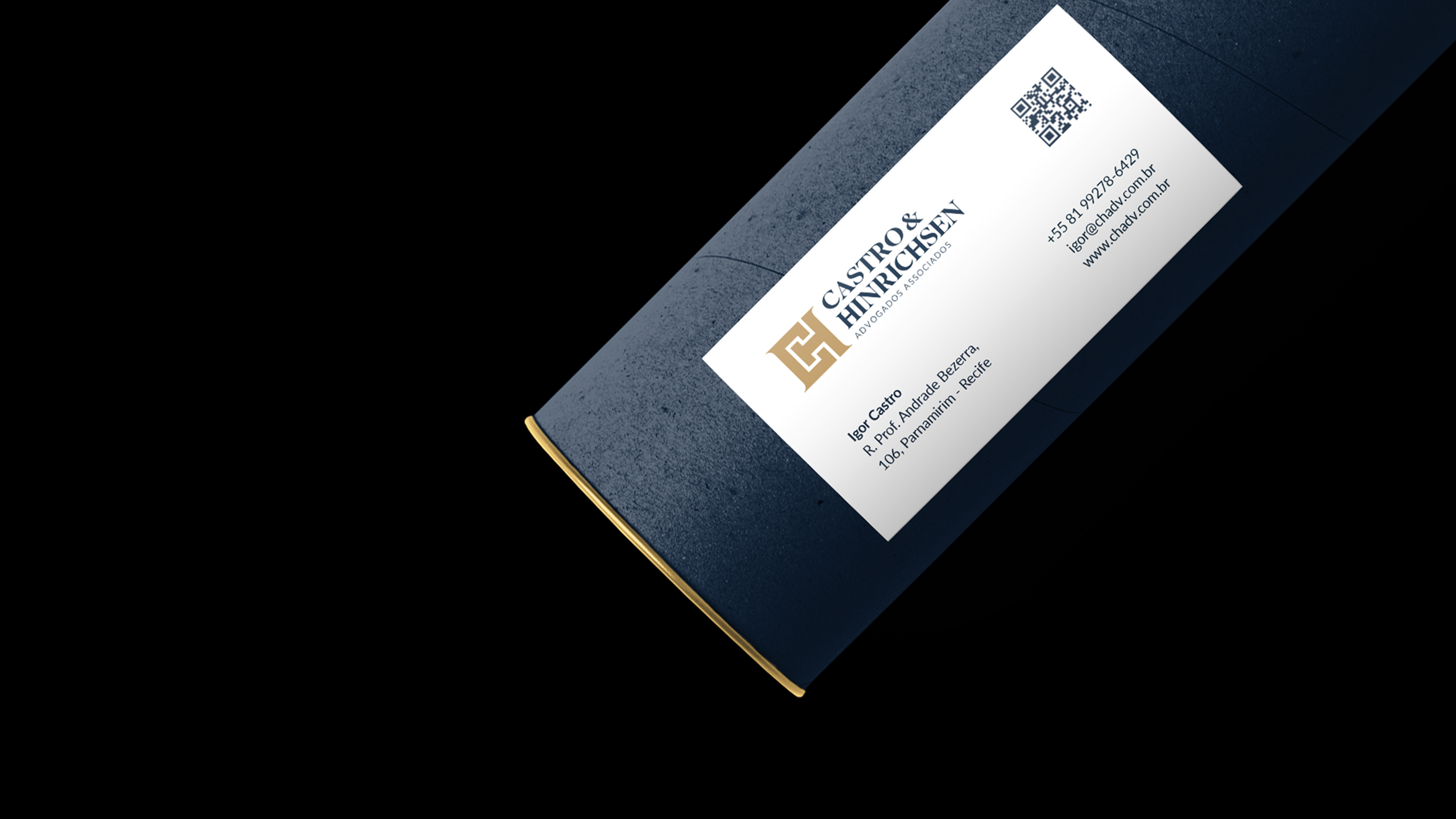
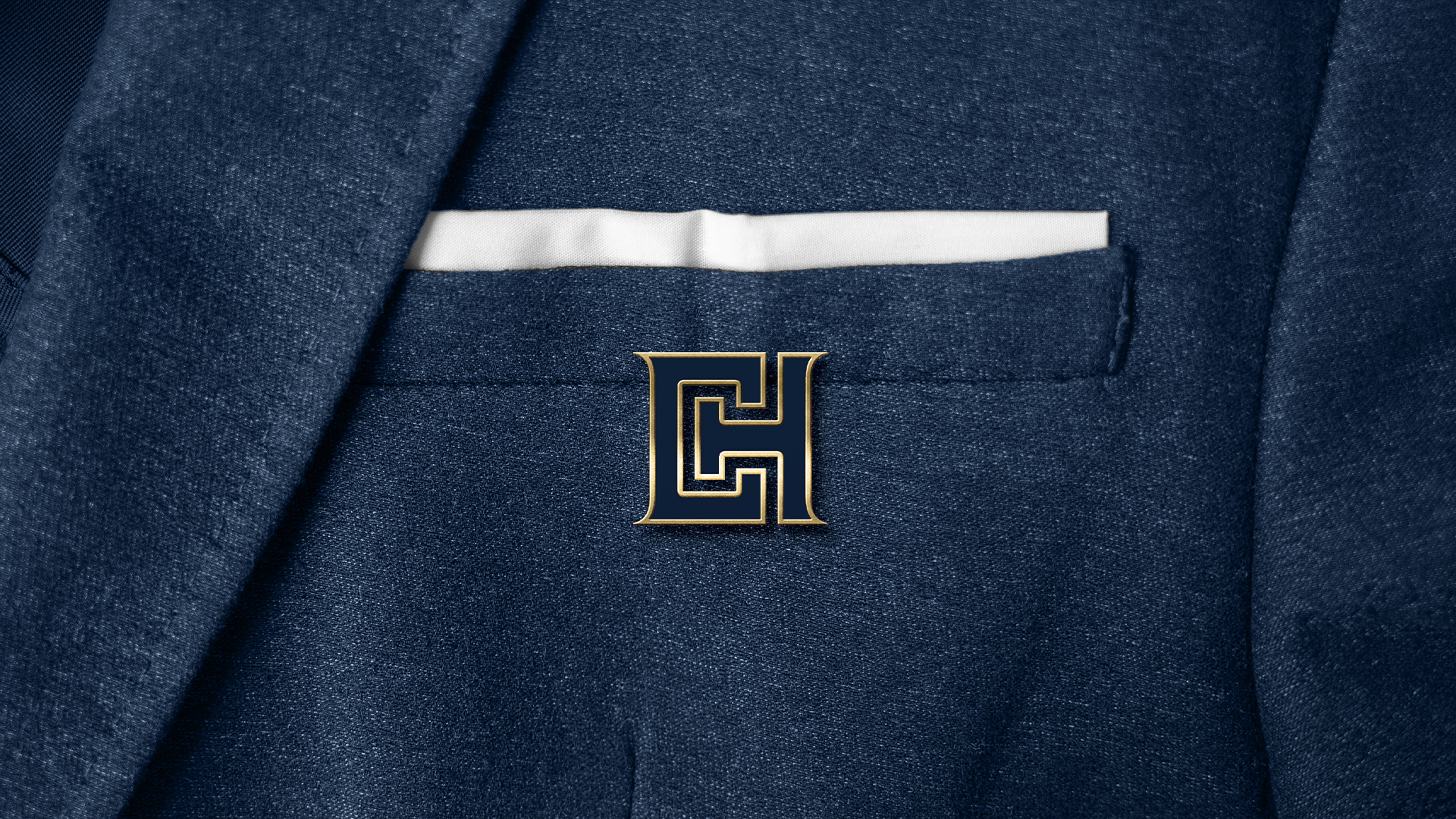
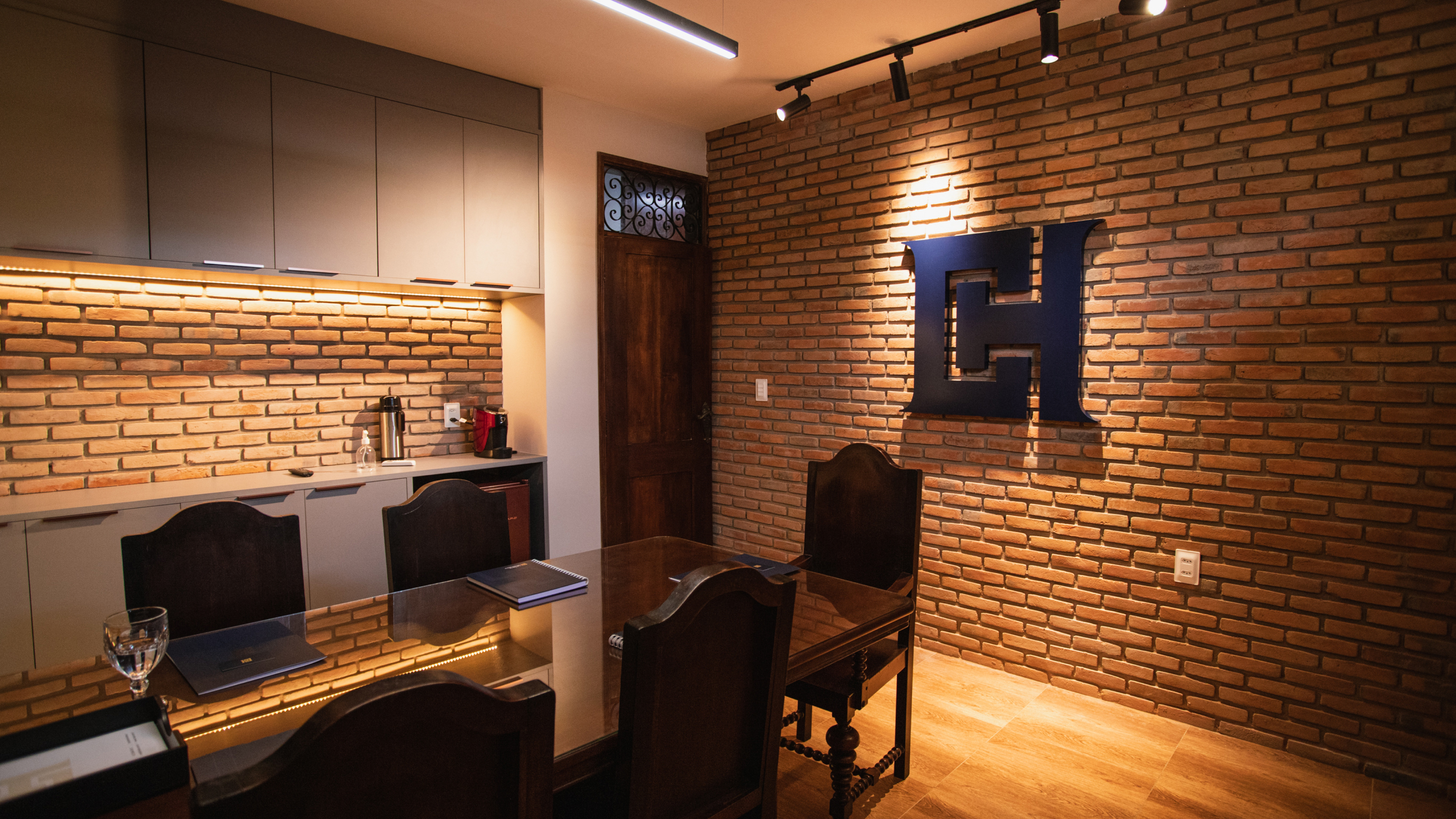
Castro & Hinrichsen
A law firm specializing in Medical and Health Law, Castro & Hinrichsen merges legal expertise with innovation. Founded by Igor Castro and Thiago Hinrichsen, the firm prioritizes client satisfaction, attention to detail, and organizational prowess. Seeking market differentiation, they approached us for a brand revamp. The new visual identity, designed to reflect their legal acumen and service quality, combines the letters “C” and “H” with a Greek pillar symbol. The typography, based on a geometric grid, ensures readability, while an updated color palette adds vibrancy to the brand's presence.