
Prop
EN
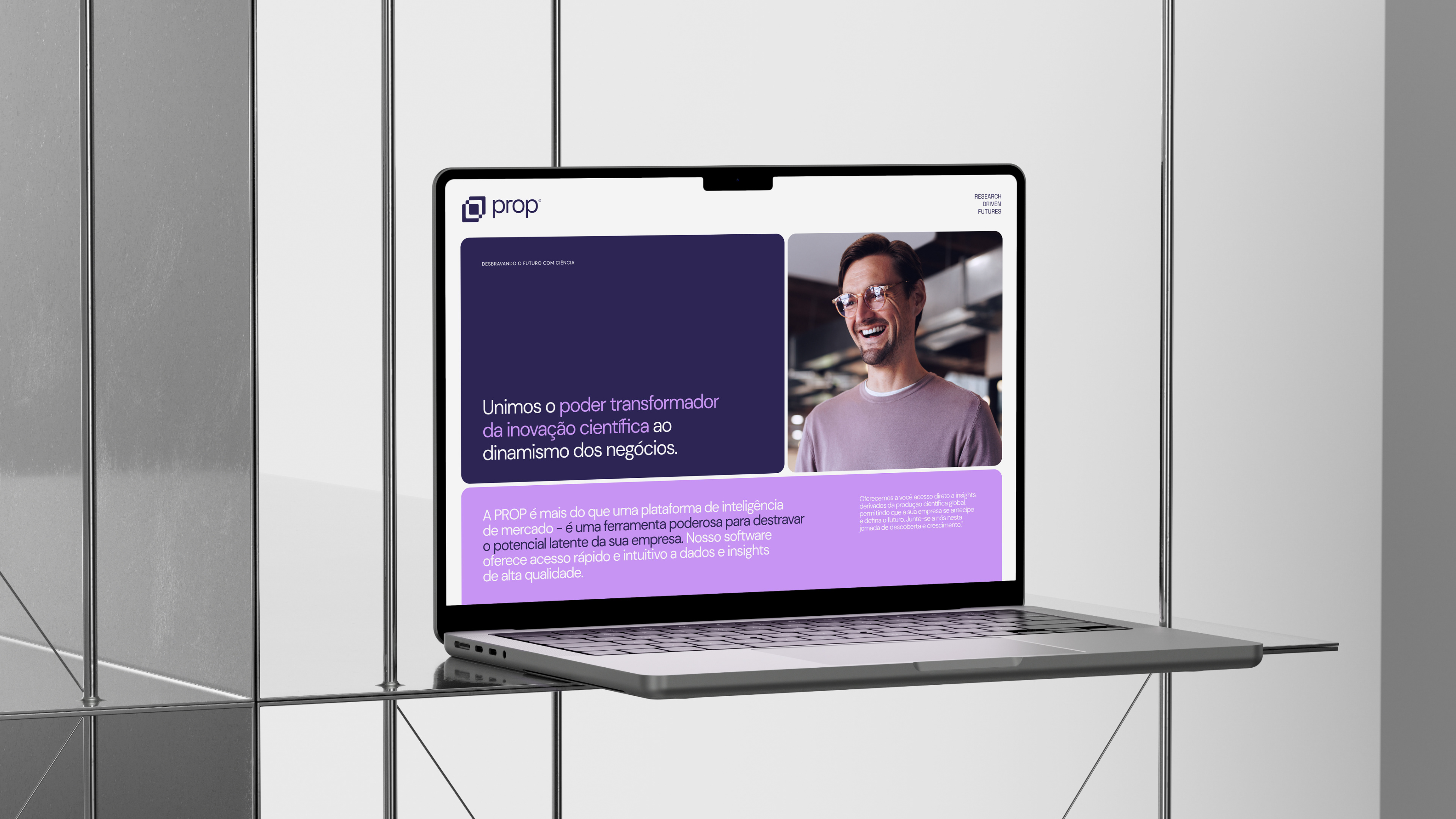
Background: In an era of rapid technological advancement, the bridge between scientific discoveries and their real-world applications is more crucial than ever. Prop stands as a beacon in this landscape, lighting the way for businesses to harness the latent potential of scientific innovations. By connecting the dots between innovation producers and business implementers, Prop is more than just a market intelligence platform – it's the key to the future.
Challenge: At the heart of Prop's challenge was the need to cultivate a visual atmosphere that conveyed perceptions of innovation, science, technology, and the future. The primary aim was to create a striking brand presence in the market where the company operates, fostering prominence and differentiation. Alongside this vision, the vast expanse of global scientific output offers a wealth of insights. However, navigating this vastness is a daunting task. Companies, especially those heavily invested in R&D and Innovation, seek a tool that not only provides access to these insights but also translates them into actionable strategies. Hence, an additional challenge for Prop was to design an intuitive platform that provides rapid access to global scientific insights and forges valuable connections with field experts.
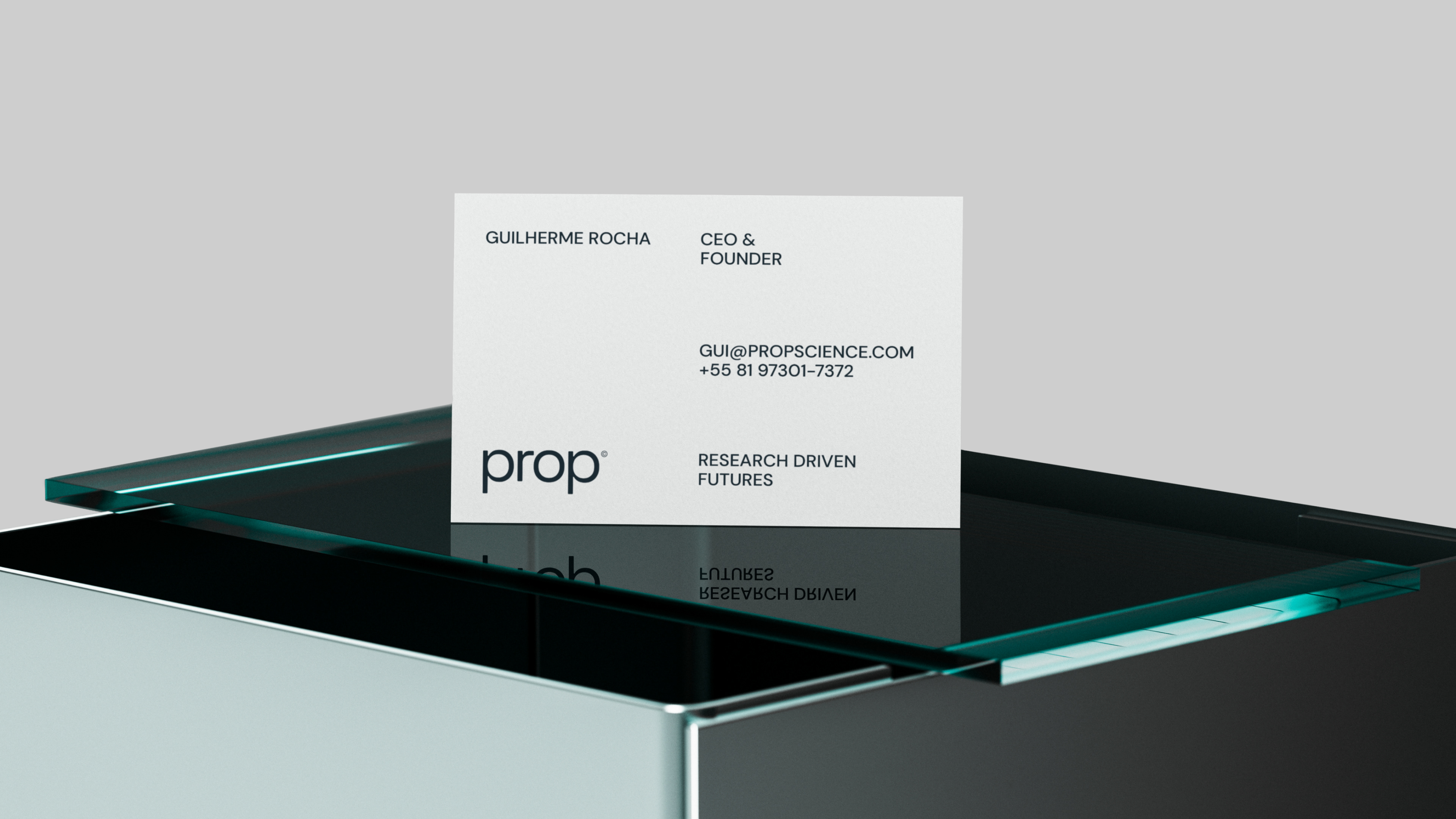
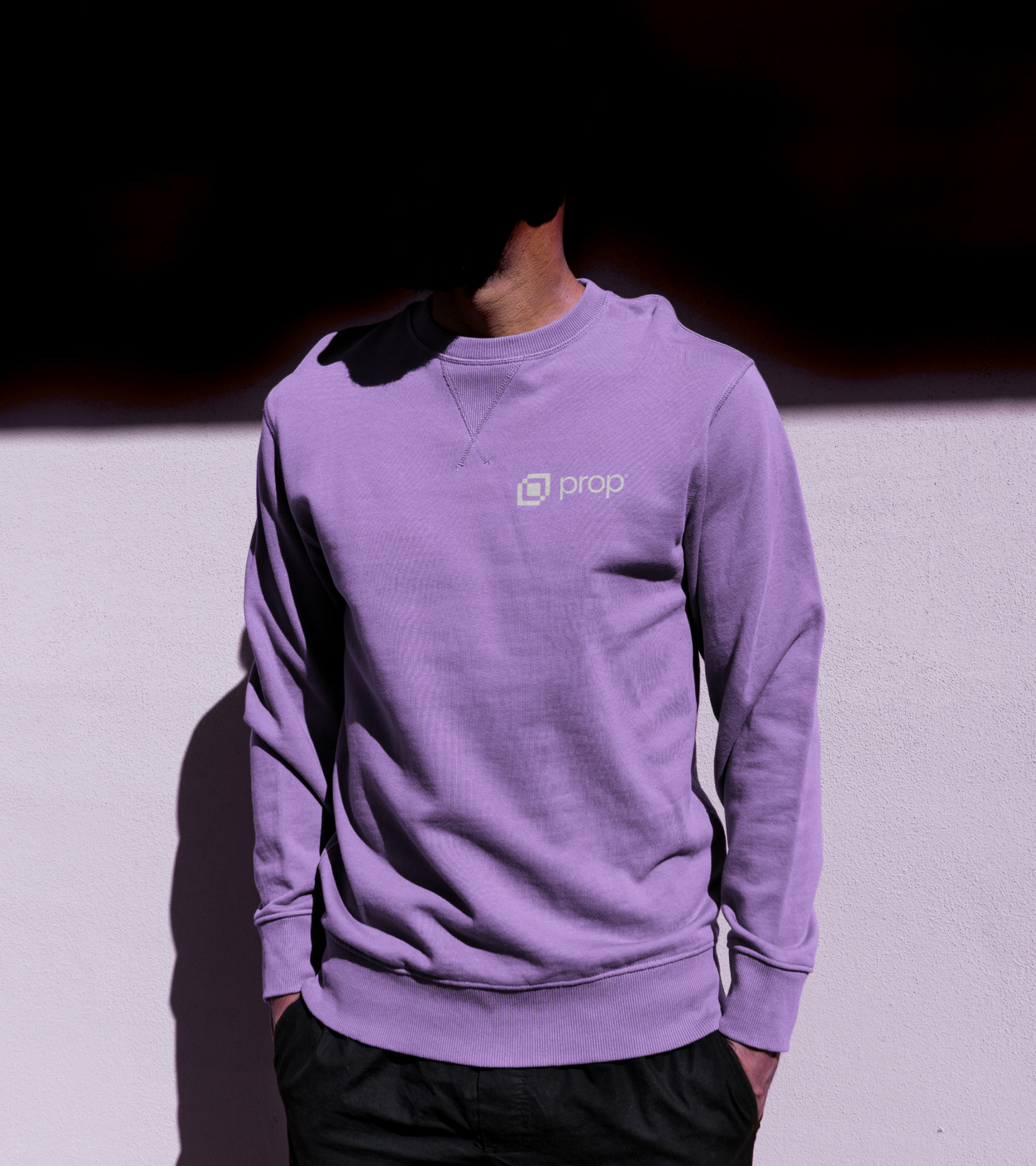
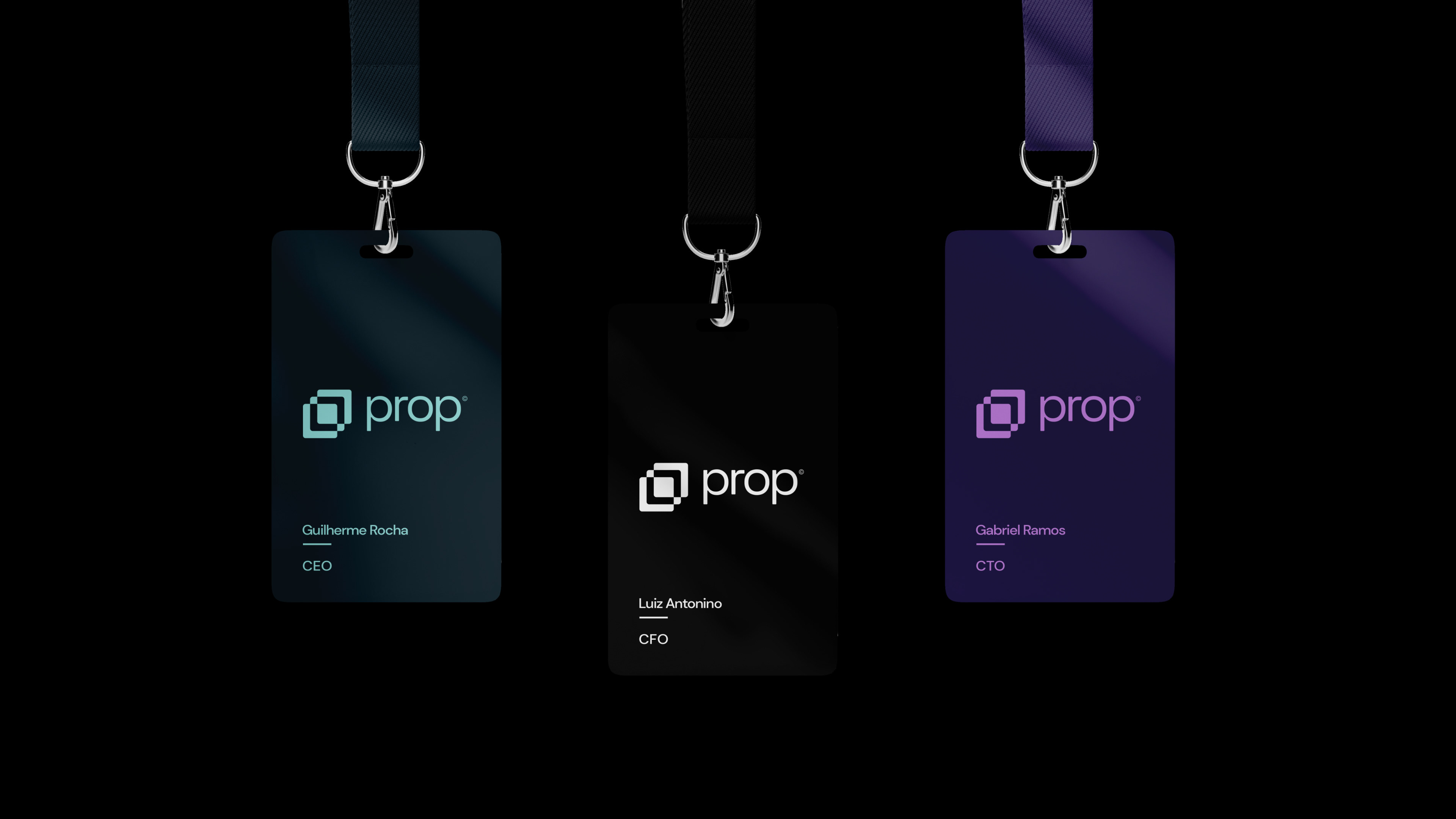
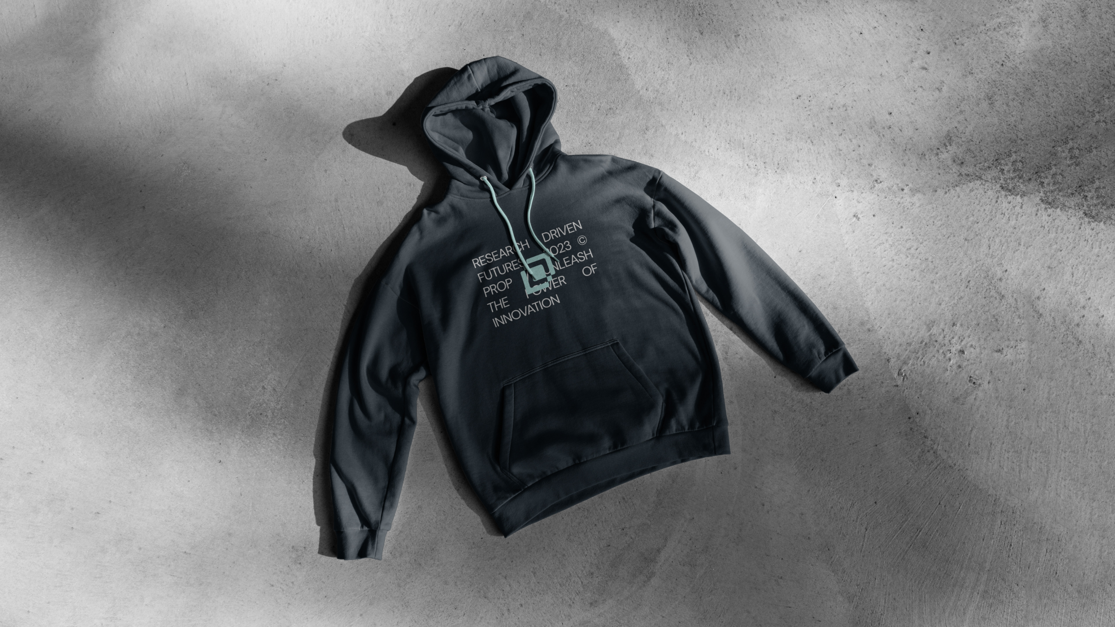
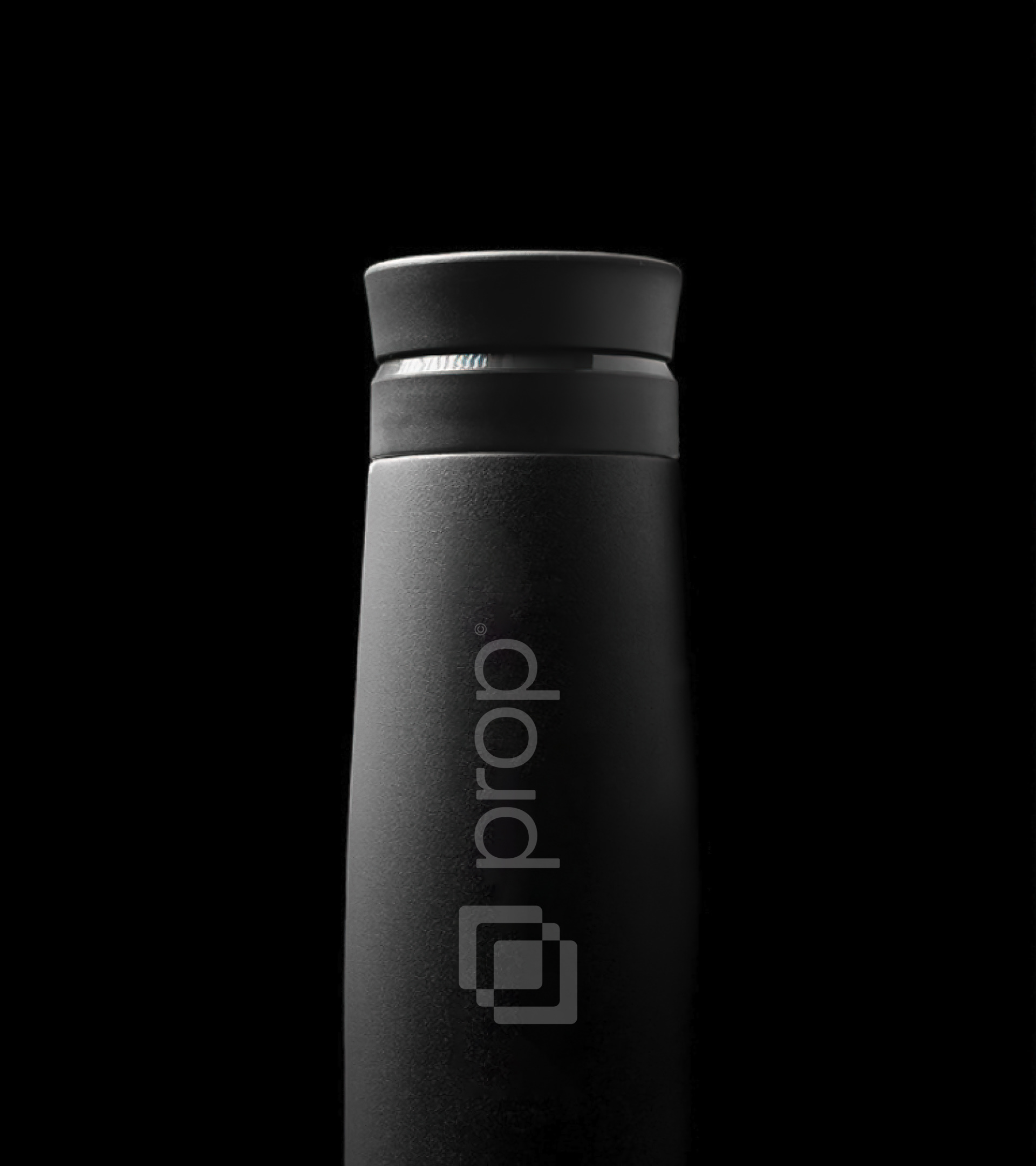
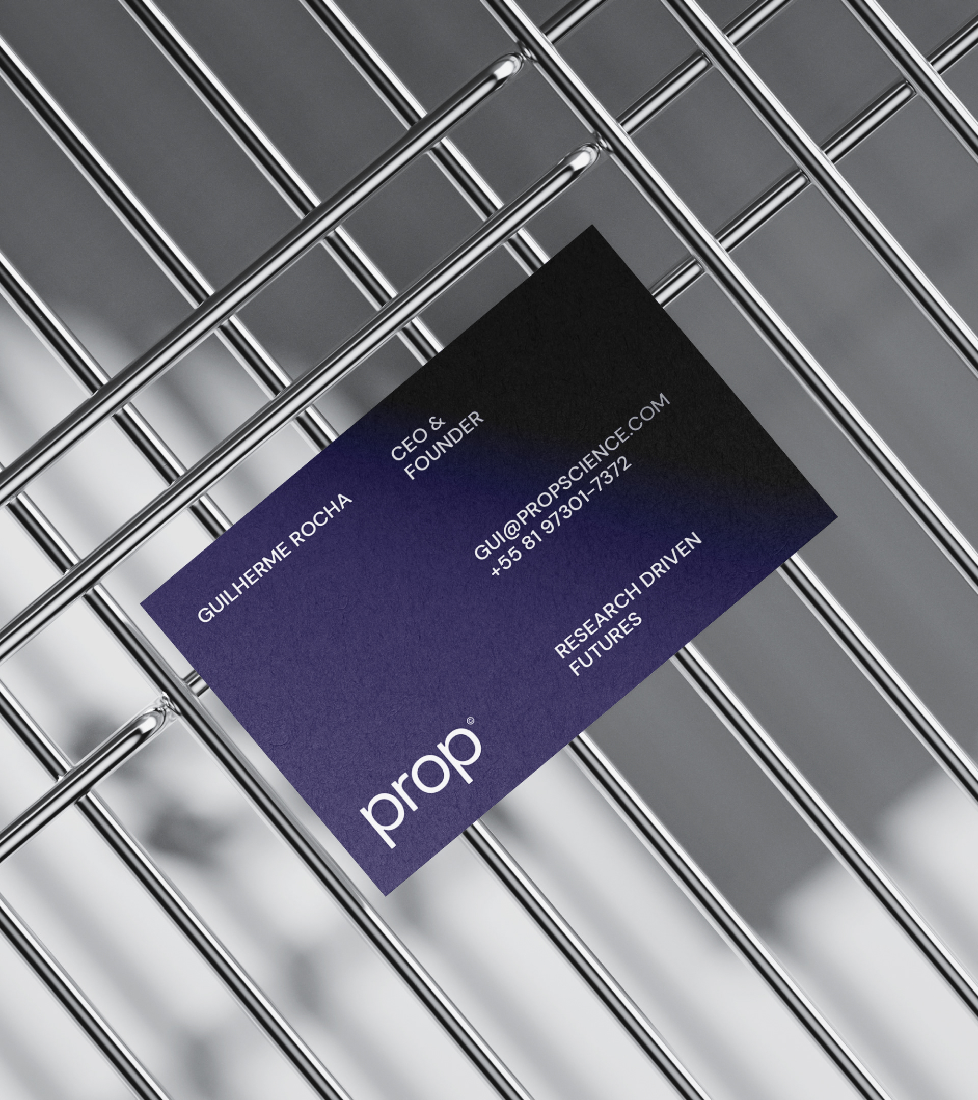
Solution: Our approach for the Prop brand was anchored in its core values and vision. We began by crafting a brand personality that embodies the spirit of a visionary pioneer - imaginative, intriguing, and consistently ahead of the curve. We introduced a modern and vibrant color scheme, primarily leaning into shades of purple and cyan, to radiate the aura of modernity and innovation we desired. Furthermore, we designed a geometric symbol with slightly rounded corners, effectively conveying the targeted attributes and serving as a key component in the ensemble, bringing life to this brand set to redefine our current understanding and, above all, the future. The color palette, symbol, and typography were articulated to reflect Prop's dedication to innovation, integrity, collaboration, pioneering, and tangible impact.
PROJECT TEAM
Year — 2023
Task — Brand Strategy & Visual Identity
Strategic & Creative Leader — Arthur Galvão
Brand Design — Arthur Galvão
Brand Strategy — Arthur Galvão
Motion Design — Klayton Fadul
Studio — GLV BRANDS
PT
Contexto: Em uma era de rápido avanço tecnológico, a ponte entre descobertas científicas e suas aplicações no mundo real é mais crucial do que nunca. A Prop surge como um farol nesta paisagem, iluminando o caminho para as empresas aproveitarem o potencial latente das inovações científicas. Ao conectar os pontos entre produtores de inovação e implementadores de negócios, a Prop é mais do que apenas uma plataforma de inteligência de mercado - é a chave para o futuro.
Desafio: No centro do desafio da Prop estava a necessidade de desenvolver uma atmosfera visual que trouxesse a percepção de inovação, ciência, tecnologia e o futuro. O objetivo primordial era criar uma marca impactante no mercado em que a empresa está localizada, gerando proeminência e diferenciação. Em paralelo a essa visão, o vasto oceano da produção científica global apresenta um tesouro de insights. No entanto, navegar por essa extensão é uma tarefa assustadora. As empresas, especialmente aquelas fortemente investidas em P&D e Inovação, buscam uma ferramenta que não apenas forneça acesso a esses insights, mas também os transforme em estratégias acionáveis. Assim, o desafio adicional para Prop era criar uma plataforma intuitiva que oferecesse acesso rápido a insights científicos globais e estabelecesse conexões valiosas com especialistas no campo.
Solução: Nossa abordagem para a marca da Prop foi enraizada em seus valores centrais e visão. Começamos criando uma personalidade de marca que incorpora o espírito de um pioneiro visionário - imaginativo, intrigante e sempre à frente da curva. Estabelecemos um esquema de cores moderno e vibrante, que trabalha principalmente com tons de roxo e ciano, proporcionando o ar de modernidade e inovação que precisávamos. Além disso, projetamos um símbolo geométrico com cantos levemente arredondados, que consegue transmitir os atributos pretendidos e ser uma peça crucial no conjunto, dando vida a esta marca que veio para mudar o que conhecemos hoje e, acima de tudo, o futuro. A paleta de cores, símbolo e tipografia foram definidos para refletir o compromisso da Prop com inovação, integridade, colaboração, pioneirismo e impacto tangível.